 Here is a dirty little secret:
Unless you are a exceptionally content heavy website And your content changes every day, it is quite unlikely that your Top 25 of anything changes all that much.
So why do we insist on stuffing our dashboards with top x or this and top y of that and top z of whatever? Let me explain with an example.
Here are the keywords driving traffic for one month:

And here are the keywords driving traffic to the website in the second month:

Notice something amazing? While traffic is very different in those two months the actual keywords that sent traffic from search engines barely changed. In fact even the order in which the keywords sent traffic is astonishingly similar!
I bet most of you (ok atleast you Analysts) are not actually surprised at this because you get dashboards, reports, data pukes and it all seems to be the same all of the time.
The reason for this is also not very surprising. Most websites are in stable businesses, they tend to do the same things when it comes to their acquisition strategy and there is a heavy concentration of the few things visitors want from them.
Yes there are some things happening "under the water" but they can be hard to find (take time and effort!) and our web analytics tools don't make it easy for us to identify those elements.
This leads to a few very sad outcomes:
1) We, Analysts, dutifully keep shoveling data over the fence (and that in our hearts of heart does not make us happy).
2) The Marketers and Decision Makers are frustrated because they think web analytics means stuffing their Inboxes with things they don't want to read.
3) Takes a really long time to take any action because the core things that matter are not apparent. Unhappy bosses.
So what's the solution?

Focusing your analytical and reporting efforts on "What's Changed".
ClickTracks, mentioned often here and in my book :), is a great web analytics tool and one of my all time favorite reports is the What's Changed Report.
It is quite brilliant in its execution.
You can choose any two time periods and ClickTracks will churn through all your website data, apply intelligent mathematical algorithms (statistical significance etc) and present a report to you that shows the most significant changes along all your data dimensions. It's Dr. Stephen Turner and his team at their best (IMHO :).
Awesome, because rather than looking at the top x of whatever you look at every day now you can look at just the data that matters.
Search key words worth paying attention to. . . .
Here is how the What's Changed report looks if I compare two time periods:
[Click on the image above for a higher resolution picture.]
Isn't that fantastic!
You can separate the wheat from the chaff by pressing just one button and now you know, instantly, which key words / key phrases need your attention because they have started sending a lot more traffic in the current time period. Maybe these need to go directly into your AdWords or AdCenter campaigns.
You also know which keyword are "falling", becoming less important in your data (perhaps you should drop 'em, perhaps you spent a lot of money to no effect, perhaps customers are moving on). You are SEO'ing your poor heart out, are your efforts working?
Both sides of the report very actionable because they uncover things "below the surface", things that web analytics tools are typically bad at highlighting.
Once you pick your time period you can get this view for all your data.
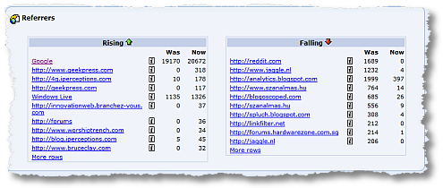
Referrers worth paying attention to. . . .
[Click on the image above for a higher resolution picture.]
Which campaigns are working, which are not. What websites are new surprises, on the left, and which ones are on their way to becoming disappointments, most likely on the right. Who should I start relationships with (say new affiliates) and which ones I need just let go. You get the idea.
See what I mean when I say it is absolutely actionable?
[Special Note: Please do not type in all the url's above and check 'em out. Some of them are from websites of an adult nature and might not be office worthy. The data is real for my blog, and no you can't ask me why they link to a web analytics blog. Your guesses are welcome though. :)]
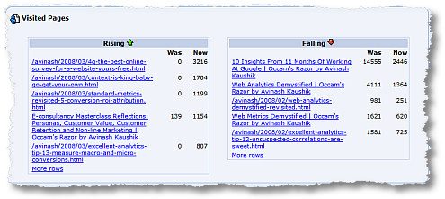
Content consumption, pages, worth paying attention to. . . .
[Click on the image above for a higher resolution picture.]
Again all of the above questions and techniques apply in making this valuable.
To me there were two surprises in the above picture.
On the "Rising" side one post, on Personas and Non-Line marketing, became so much more popular. It was written months and months ago. Suddenly it popped. I immediately rushed to check out Entrance Keywords and Entrance Sources and found the reason and I am taking action so that I can get other posts get that same bang!
On the falling side the surprise was that I did not realize in the last month three of those posts (besides the first) were that popular, all were written months and months ago. So in this case I am realizing what I should have known a month ago! If I were doing any sales or marketing or had key topical (important now) calls to action I would go add to these post.
Other reports / data. . . .
You can get this report along many other dimensions telling you what campaigns are working better or worse, what products are selling more or less (statistically) and other such great trends.
Very useful, very actionable, access to trends and insights that are normally hidden. Access to this kind of report helps you do the 90/10 that Tiger Woods is advocating. . . .

Today sadly with our Web Analytics tools we spend 90% of the time reporting on what you/company did and send masses of reports out, and 10% on what we / you / Marketers should do next. [My thanks to the Accenture corporation for creating such a great ad.]
What's Changed changes that.
Recently our good friends from Juice Analytics have taken a step to help the Users of Google Analytics create their own What's Changed report for Referrers. You'll find all the details at: http://is.gd/5Kw
You go to the site , spend nine seconds install GreaseMonkey in your firefox browser and then spend another nine seconds installing the plugin, two seconds restarting your browser and boom! You get this. . . .

A new button in your Top Referrers report.
Now go ahead and press that button, it will change to a button called Loading…. and after a few seconds (please be patient) you get two additional reports on that page.
#1: Sites with more than 50% growth in traffic in last 3 days:
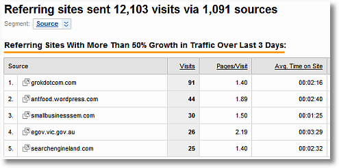
Sweet! Now compare that to my Top Referrers report. . . .

You can easily see how the first report is more valuable than the default report, for one thing top referrers stays the same most of the time.
I can look at the first report and go identify who my real friends are :), why they are sending me traffic, what can I do to get them to my top referrers etc.
#2: Sites with more than 50% growth in traffic in last 3 days:

I won't repeat the message again, you can see how immediately valuable this type of information it (not the least to realize that my friends at Zaaz might not be telling the complete truth when they tell me they read my blog every day! Chris, Jason, Shane I don't believe you! :)).
Go run and install the plugin from Juice Analytics right now and see how quickly you can spot new things in your reports.
The "what's changed" functionality in Google Analytics is not quite as robust or pervasive or flexible as it is in ClickTracks. Hopefully someone from Juice Analytics or the Google Analytics team is reading this post :) and perhaps there will be more in the future. But for now I am thrilled that users of Google Analytics can atleast take a small step forward in understanding their data. For that I am grateful to the folks at Juice.
[Sal: I would love to have this "button" on the Search Keywords reports! Please.]
Update: 04/23: Sal kindly obliged and we have a very useful button now in the search keywords report as well to look at "What's Changed". Please see: Keyword Trends in Google Analytics. Here is now it looks (KW that sent 20% more traffic). . . .
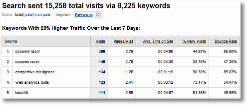
Web Analytics is actionable, I hope that all the Vendors will take a pause from simply helping us Puke data out and consider implementing mathematical and statistical techniques that help us all become the Tiger Woods!
So here's my question to you: When you do reporting of your web analytics data are you on the What's Changed train?
Ok now your turn. Would you care to share some of your insights? Big or small? What has worked for you? Are there other techniques that you have tried that work for you? Any templates or pictures you could like to share with us? Please share your own strategies and success stories. Thank you.
PS:
Couple other related posts you might find interesting:



 Via
Via 



I only have time for a brief comment…because I need to install Greasemonkey and try out the Juice Analytics script! Awesome post, Avinash!
Your comment about how ClickTracks "applies intelligent mathematical algorithms (statistical significance etc)" in crunching the What's Changed report really jumped out at me. I've never used ClickTracks, but this seems like a feature other tools should add to their product roadmaps.
Many WA tools have he ability to show a side-by-side "% Change" factor when comparing one time period to another. And, they allow sorting by that % change. The problem is that the highest raw delta %s come from the long tail — a page that went from 2 visits to 4 visits has a 100% increase…largely due to noise. So, that requires some export-and-then-manipulate-in-Excel to try to get to a remotely meaningful list of changes. And that was still using some awfully crude logic.
Thanks for the great observation and pointers to some useful toys (ahem…I mean…tools…)
Nice post, Avinash, and thanks for the link to the greasemonkey 'what changed' script.
Off-topic question: what do you use to generate the "ripped edge" effect on your images?
Cheers
Alan
http://www.rkgblog.com
you are definitely going to be in juice analytics' "what's changed" report! Great plugin, thanks for sharing.
Alan Rimm-Kaufman: amazing, I was just asking myself the same question !
Avinash:
1) Your 90-10 description (of too much time spent on reporting, and too little on finding action-items) strikes to the point.
2) G-R-E-A-T link for FF greasMonkey script. I also hope GA will enhance the "compare dates" with some "what's changed" features.
Thanks for the good post and writing !
p.s: I wonder if someone else will also note the special case demonstrated of "occam's razor" on your third screen shot at – :Search key words worth paying attention to. . . ."
Tal.
First: to Alan and Tal…get Snag-It. You'll enjoy it. Robbin Steif pointed me to it. Its pretty neat.
Second: Avinash, you've actually hired a team of analysts to be creating this stuff right? I mean, no human has the time necessary to create the work and play with the toys you seem to find in every corner. Great work. I love the concept. Stagnating is a terrible thing. Looking at similar numbers every week its a natural progression to settle in and chuck out the same statements. I'm thrilled to see that these reports are starting to be composed in tools. Drawing data and creating them in excel or access is exciting at first, but then updating linked tables and reference cells gets to be a dedicated resource task of its own.
On another side note, I'm disappointed we won't be co-presenting in San Fran at eMetrics, however, I look forward having a discussion or two if possible. I'm excited, on another note, that I won't be competing for a time slot with you either.
Best Wishes…
Daniel Shields
Hi Avinash,
I need to process this "what's changed" notion a little more before I make any comments on it, but one thing I wanted to add in here is that it can be a GOOD thing to see that your numbers are consistent on a weekly basis or whatever the timeframe measured (of course, only if the consistency shows that what you are doing is good). It's when they are not consistent and/or show that you need to improve something that you have to really start being an analyst and figure out "what to do next".
Everyone : Hello from my beautiful homeland: India. Agra is hot! Literally.
Tim : Amen! Are any vendors listening? :)
You are very right about not simply looking at the largest % difference, they may or may not be statistically significant. That's what's so awesome about what CT does.
Alan : I use BlogDesk to write my posts, it allows you to apply a few picture effects, all very lovely. I love BlogDesk for more things beyond just the picture stuff, I highly recommend it as a writer.
YE : ^)
Tal : Don't over analyze my personal reports! :)
Daniel : One of the greatest benefits of the blog – its ability to teach and also encourage me to learn. I don't think I would be as modestly smart as I am about RSS and SEM and Social Media Metrics and so much more without this blog. Also life analyzing just page views is boring. :)
Thanks for the comments everyone, I am thrilled that you all continue to find my stories here interesting.
-Avinash.
Avinash,
Pretty much every one of my comments to you starts out with 'Great Post!' and this is no exception.
I think that the heart of your post is Trend Analysis and having the tools to quickly filter away the data that is not indictive of trends…either upswinging trends or downturning trends.
As you are so fond of pointing out in your posts on Web Analytics 2.0, it's all about gaining actionable insights. Being able to highlight and bring huge and measurable swings into the open provides us with actionable insights that can be acted on.
If there is a sudden surge in interest in a specific content topic, you have the power to provide additional postings on that topic and respond to visitor interests. Downturns in interest can be equally as insightful and impact site or company offerings.
I agree with Tim when he mentions that product managers of analytics tools should wake up and incorporate tools that can help highlight trends more easily.
The problem is…I don't want to wait for the next release of my tool. I want those tools, NOW!!!
PS: Yeah, I like the Tiger Wood creative in this case too.
Alice Cooper's Stalker
Hey Avinash
Welcome to India!!
Please pay a visit to Delhi too, and hold a seminar/workshop on WA for us. I'm sure we all are dying to hear you here.
Cheers!
Hi Avinash. Neat stuff!
I am responsible for one of those "content-heavy" websites, and even though I get plenty of change in my "top X" reports, they don't lead to many insights.
The capability I absolutely can't live without on the "What's Changed Train" is groupings, both from a content perspective and from a referrer perspective. A change in exposure of a particular page of a particular book doesn't mean anything, but relatively more views to book content, as opposed to other types of content on my site, could signal something significant. For referrers, I use groupings of known blog URLs, web-based email referrers, affiliate sites, customers, etc. Individually, a mention on a blog would be buried too far down in a Top X report to ever see the light of day, but when like referrers are grouped together it's obvious when something's changed.
angie
Avinash I will help you in your efforts about humility and not tell you what a great post is this :P
One little thing: I think in your second #2: Sites with more than 50% growth in traffic in last 3 days: You maybe wanted to say: "new referring sites appearing in last 3 days."
Enjoy your 'hot' vacation Avinash :-).
Great tips for any analyst, especially the 90/10 rule.Too often we work overtime to analyze what we did wrong (in the past) instead of using that time to think about how we approach the future. Also, in addtion to being on the 'What has changed' train I think one should also have the right resources lined up for alternative transportation in case he 'missed the boat' on any critical things :-).
And lastly, about certain referrers directing traffic to your blog — I would think that was an easy guess with you mentioning the likes of Angelina Jolie in your blogs :-)
Hey Avinash,
I agree this is one of the most valuable reports as it cuts through the clutter of 100s of data points into something you can learn from. Somehow I'm tied to GA and usually takes 30mins to pull this off in excel..so got to get on the juice :)
Though once you find out what's changed, the next question to answer is why did it change? Since nothing happens in a vacuum, a change on pageviews came from a change in site visits, and many times both direct and search (which can help to answer the why) It would be nice if these change reports were able to do the linkage between metrics to get closer on what was the trigger that made this all happen…
Maybe thats why they call it web analytics 2.0…because it's all the features you want and no tool to provide it ;)
anyways nice find!
Interesting Post Avinash! (again…. ;-) )
One wonders about the format display of the what's changed in your examples. It's still… hard to see what matters and note the significant changes.
For myself when doing these what's changed style, I find a stacked percentage graph to work very nicely. X Axis == Time. Y Axis == 0-100%.
If memory serves one of the ultra few things I did like about webtrends many years ago, was that it did give you such a graph on keywords. Thus I could see keyword percentages change over the week.
Sun/Mon would be things like "hernia" or "groin strain". Thurs/Fri would be "stress" or "mental health".
Gee I wonder why….. ;-)
Cheers!
– Steve
Juice Analytics amazes again! This is very very cool stuff. And a great lesson on where to focus. Personally I still go with the wacky Excel route for the reasons Tim Wilson mentions way above. I can kindof build in my own significance factors, since my tools don't do it for me.
BTW, you probably know this, but your weird referrals are referral spam. One of the plagues of blogs (along with trackback and comment spam). The cool thing about referral spam (imho) is that it goes to show that people are looking at some web analytics data: referrals! Bring on the onsite search spam! It wouldn't be effective spamming practice if no one was looking ;)
Brilliant article Avinash, it's definitely convinced me to buy your book because if your free advice is this good, the book must be even better!
Keyword Trends just as requested.
-Sal
This is an absolutely amazing post about the real things to watch in your web analytics! Too many online marketers miss this.
Great post! Sharing with my audience immediately.
Maria Reyes-Mcdavis
You make the point in the first sentence of your blog that if your site is not changing then obviously the top 25 things in your site wont change as well.
Somebody ( in comment #2 ) asked how you create the torn edge effect on some of your images; I didn't see an answer. But it's a very attractive effect … if you feel inclined to share, I'm also curious. Sorry for the tangent.
You asked for guesses as to why porn sites are linking to you … I don't think they are. I see a lot of the same thing in my own referral reports: sites I could be fired for viewing at work sending traffic to a landscape photography blog. It makes no sense.
Except that a lot of web servers are configured to publish reports ( to the general public ) by default. Some people run software to create "referral spam" or to visit your site and spoof the referral header. The goals are to get you to wonder who this site is, sending you traffic, and glean a click, but also to get a link from your stats. At least that's what I've deduced from my own experience…
Hi Forrest, Avinash uses (blogdesk.org) in order to create the torn edge effect on images;
I gave that question – and He answered by Email, And I guess he would love for everyone else here to also know – so now we all know :)
Tal.
Angie : If memory serves me right then with ClickTracks you can create content groupings (using Advanced Segmentation) and then it would compute for you the "What's Changed" metric.
Nick : No matter how smart the tools get you will still need humans (mercifully) to figure out the Why. The What's Changed report makes the Analyst's life easier, raises the right questions. Then the real work starts.
Even with smart tools the 10/90 rule still applies! :)
Jen : You are a exception, not the rule!
On the other point, one of the referrers is a spam site, but it was the soft core website I did not want people typing. And that is a legitimate link, turns out they have a great deal of interest in Google and linked to my Working For Google post. Who can blame them. :)
Forrest : In comment #7 (mine) above I do mention that the "torn effect" is from BlogDesk, my blog writing software.
See immediately above for the explanation of the soft core link, it was legit. I researched. :)
Thanks everyone!
-Avinash.
Avinash, Another home run hit out of the ballpark. I love the idea of looking at "what changed" and connected to this post from the very beginning. Before the acquisition, the top two search terms that brought people to our site – month in and month out, was "maxamine" spelled correctly, followed by "maximine" misspelled. Everything else paled by comparison. Our name and spokesperson are a bit more memorable these days :-)
Debbie Pascoe
Outstanding post! The ideas and insights are very worth reading. You really gave me valuable information. Thanks for sharing it!
Great post…I ran into your post while I was looking for materials to extract more value out of the Coremetrics reports. CoreMetrics has the so-called "What's Changed" feature as well.
[…]
Make Web Analytics Actionable: Focus On “What’s Changed” – “Must Read!”
[…]
[…] Instead, you should hunt for the insights and be “Web Analytics Ninja” as Avinash Kaushik stated in his presentation “Hunting Actionable Insights“: […]
Thanks so much! I've been looking for something like this…, wondering why it wasnt a standard part of Analytics. I just Twitted your post :)
Seems ClickTracks is now part of Lyris and only available as 'integrated' solution with web hosting, cms etc. Very unfortunate. Are there any alternatives out there?
Thanks!
Funny how such a valuable report continues to be overlooked by most web analytics vendors. We'd hate to see it disappear, so we built one for Google Analytics users. It runs inside Excel, and we've tried to make it as flexible as possible so people can tailor it to their unique website objectives.
http://www.nextanalytics.com/whats-changed-report
Hi Avinash,
I know I'm a little late to the Clicktracks party but it now seems to be taken over by a company called Lyris. Does anyone know a similar solution which doesn't fall under the Lyris umbrella?
Thanks,
Michael
The Firefox plugin mentioned on this webpage and in your book is no longer available. Is there "what's changed" functionality in Google Analytics now, perhaps as a custom report or dashboard…
Muskie: There are two options you have to perhaps do even more clever things in Google Analytics:
Use weighted sort, it is still available for many of the percentage based metrics and automagically shows you the most important rows to focus on. Here's a helpful post: End of Dumb Tables in Web Analytics Tools! Hello: Weighted Sort.
Use custom alerts to identify when the known unknowns are occurring. A bit more work than a nice what's changed button, but the same outcome. Here's a post: Identify The Known Unknowns: Leverage Analytics Custom Alerts.
-Avinash.