I worry about data’s last-mile gap a lot. As a lover of data-influenced decision making, perhaps you worry as well.
A lot of hard work has gone into collecting the requirements and implementation. An additional massive investment was made in the effort to perform ninja like analysis. The end result was a collection trends and insights.
The last-mile gap is the distance between your trends and getting an influential company leader to take action.
Your biggest asset in closing that last-mile gap is the way you present the data.
On a slide. On a dashboard in Google Data Studio. Or simply something you plan to sketch on a whiteboard. This presentation of the data will decide if your trends and insights are understood, accepted and inferences drawn as to what action should be taken.
If your data presentation is good, you reduce the last-mile gap. If your data presentation is confusing/complex/wild, all the hard work that went into collecting the data, analyzing it, digging for context will all be for naught.
With the benefits so obvious, you might imagine that the last-mile gap is not a widely prevalent issue. I’m afraid that is not true. I see reports, dashboards, presentations with wide gaps. It breaks my heart, because I can truly appreciate all that hard work that went into creating work that resulted in no data-influence.
Hence today, one more look at this pernicious problem and a collection of principles you can apply to close the last-mile gap that exists at your work.
For our lessons today, I’m using an example that comes from analysis delivered by the collective efforts of a top American university, a top 5 global consulting company, and a major industry association. The analysis is publicly available.
I’ve chosen to block out the name of entities involved. Last-mile gaps exist at all our companies. It is not important where this 2018 analysis came from. In the tiny chance that you recognize the source, I request you to keep it out of your comments as well.
For each of the 17 examples we review, I’ll share an alternative version I created. I invite you to play along and share your version of any of the examples. I’ll add them to the post, and credit you.
Ready?
Let’s go!
I persistently advocate for simplicity in slides. Don’t create handouts!
In this case the goal was to create handouts, perhaps to make it easier for audiences to consume the data by themselves. I would humbly still advocate for simplicity when it comes to data presentation.
Some of the fixes to solve for simplicity could be to use fewer sprinkles, a simpler header – graphics and text –, and we can be very selective about what’s on he slide. As you look at the slide, I’m sure you’ll come up with other ways in which we can liberate the white space for the tyranny of text/colors.
Solving for simplicity contributes to communication effectiveness. It of course reflects on your brand, and, most of all, helps you have better control over the story you are trying to tell.
For the rest of this post I’ll ignore the simplicity and storytelling elements and focus exclusively on the data itself. How, what, why and instead of.
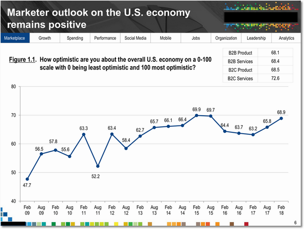
Look at the graph above, and the little table… Ponder for a moment what you would do to close the last-mile gap and help the essential message shine through.
Here are some things that stood out for me:
1. Graphing choices can exaggerate or undersell reality.
One way to exaggerate is to start your y-axis at 40, as it the case above. The resulting line exaggerates the trend and ends up implying something that might not quite be there.
Start at zero. Please.
2. False precision can cause clutter, and undercut the Analyst’s brilliance.
This is very subtle.
You’ll notice that the numbers on the graph are expressed with one decimal point. As in 47.7, 56.5, etc. If you pause and consider how this data is collected, via a small triple digit sample self-reported survey results, you’ll quickly realize that the error range in this data is likely a few points. If that’s true, showing the .6, .5 is implying a precision that simply does not exist.
Besides, this false precision also clutters the graph.
3. Remove the distractions, ruthlessly.
In an 11-year span, each data point is a lot less important than the trend. Do you need the dots on the graph? Do you even need the numbers for the individual months?
When it comes to closing the last-mile gap it is helpful to have a ruthless streak. It is helpful because in service of our ultimate objective, you’ll have to kill some of your favorite things, you’ll have push back against your boss/peers who might love clutter, and you might have to help change an entire culture. Hard, painful, work. But, immensely worth it.
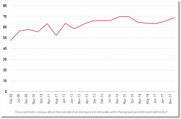
Here’s an alternative way to present the data, using nothing more than the standard settings in good old Excel:
It shows the trend, simply. You can see it is up broadly over eleven years. That it was under 50 and is now close to 70.
Did you notice the trend is not as exaggerated as the original? And, still effective!
You might use a different font, perhaps have the graph be smaller, or maybe twist the month-year in the other direction. No problem. I’m confident if you apply the first three filters, whatever you create will close the last-mile gap better.
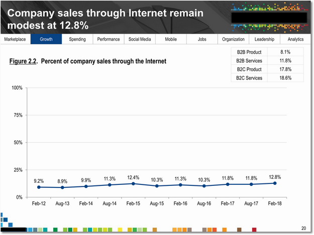
Here’s an example of doing exactly the opposite of principle #1. The y-axis is artificially set at 100%, as a result the trend is understated.
You don’t need to go this far.
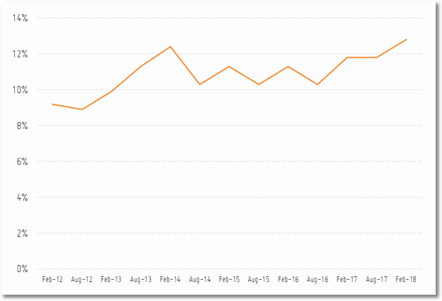
Just let your favorite graphing tool auto-set the major and minor-axis, which will result in the graph looking like this…
Simple. No funny business.
The trend stands by itself waiting your words as to why it is meaningful.
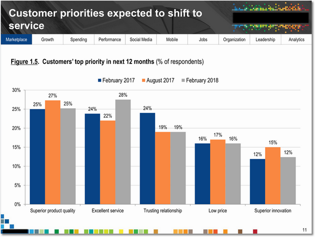
This next one is pretty interesting. My request to you is to not scroll beyond the slide. Pause. Absorb the graph. Try to understand what the author is really trying to say.
For bonus points, consider the perspective of the person reading this graph rather than the person who created it.
Read. Don’t scroll. Absorb.
How well did you understand the trend and the insight being communicated? What would you have done differently if you’d created the graph?
Here are some things that stood out for me:
4. Show as much data as is required, and no more.
The goal in the original seems to be to show top priorities for 12 months. If so, is the data for August 2017 really adding value?
Often we want to show all the data we have (after all we spent time collecting it!). In this case, it get’s in the way of understanding the 12 month shift.
5. Experiment with visualization options, even in Excel!
We have five dimensions of data, and two data points each (if you apply principle #4). We want the audience to be able to compare two data points for each dimension, and look across all five dimensions.
The bar chart is a sub-optimal way to let the audience see this. Consider experimenting with different visuals in Excel (or D3js).
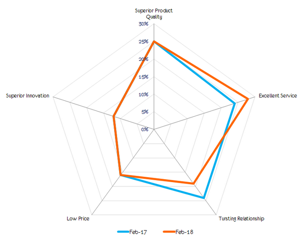
I applied the radar chart to this data, and got this lovely end result…
It is ten million times easier to see the two data points for five dimensions, and realize that only two have changed.
Likewise, the overall trend also pops out at you so much easier in this case.
It would have taken ten minutes for us to explain the data and trend in the original. We can do that in five seconds now. You can use the time remaining discussing why this trend is material and what to do about it (if anything). Actually allowing data to play its natural role: Influence decisions.
This is a really nice example of a lesson that we tend to forget all the time (myself included).
You know the exercise by now. Pause, reflect on this slide, then scroll.
Here’s what stood out for me:
6. Don’t send a graphic to do a table’s job.
In this case, we are comparing two simple data points, on two dimensions (past, present). Why do we need a graph taking up all the space?
Why not just have a table that shows previous 12 months as 7.1% and a row under it with next 12 months as 8.9%?
Even better, why not just have one line of text:
Why have two fat bars?
Once you arrive at that conclusion, you’ll apply principle #4 and realize that the most interesting data on this slide is not the visual… Rather, it is the table on the top right corner of the slide.
Bada, bing, bada, boom, ten seconds later here’s your slide:
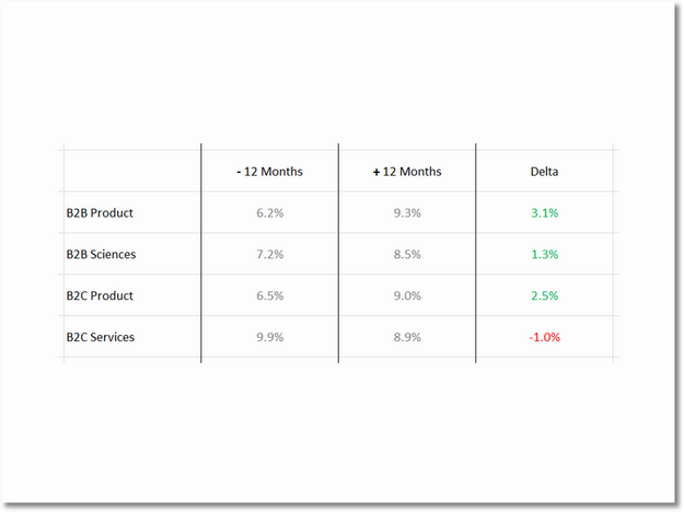
A simple table with a touch of colors that draws out the core message simply, directly and quickly.
The lighter shade for the core numbers will result in them being pushed a bit into the background. This simple choice guides the reader’s eyes gently to the delta (the most important bit).
I like playing with the borders a bit, as you see above. You might have other things you are picky about. And, that is ok. :)
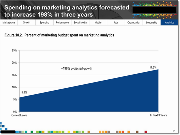
To illustrate principle #6, here’s another slide where the graphic is completely unnecessary:
A tiny table with two data points will do just fine.
Here’s a bonus lesson for the analysis ninjas out there. Please don’t imply a linear trend between “current levels” and “next three years.” There is no indication that data from 2017 to 2020 is available, and it is highly unlikely that it will follow a linear trend. This is another example of breaking principle #1.
(Let’s not lose sight of the big picture: I am delighted that spending on analytics is going to increase that much! As our leaders spend this largesse, I hope that they’ll remember the 10/90 rule to ensure optimal returns. The money needs to go to you!)
This one flummoxed me.
Let’s see if you can internalize what is going on. Stare at the graph intently, seriously, and see if you get the points…
Bold items naturally catch the eye, in this case the blue bars. Most people in the western world look from left to right, that is how you’ll likely try and understand what’s going on.
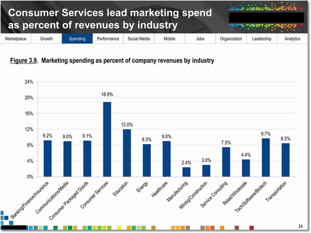
Your first impression will likely be that the blue bars are showing a random trend in marketing spending.
If you are the curious type you’ll realize that is the wrong conclusion, and you’ll want to understand what’s really going on. Soon enough you’ll get to the x-axis and a carefully review will illuminate that the reason for the weirdness is the choice to show the industry names alphabetically!
7. Please, please, please keep the end-user in mind.
In this case the end-users (our senior leaders) would be primarily be interested in understanding where marketing spending is highest and lowest. This is very difficult to accomplish above.
Secondarily, they’ll want to know where they fall in context of all other industries, this is almost impossible to accomplish above.
The reason the x-axis is organized alphabetically is to allow you to look up your specific industry easily. This thought is good. My hypothesis is that it likely forms a small percent of the use cases, primarily because just knowing your spend is not that valuable. What’s valuable are the above two use cases.
Here’s what I recommend keeping front of mind: If a non-analyst is looking at the data, what uses cases form the basis of the value they’ll extract. Then, ensure the info viz is solving for that.
In this case the bars with the data seem to be randomly sorted. The visualization is getting in the way, creating a wider last-mile gap.
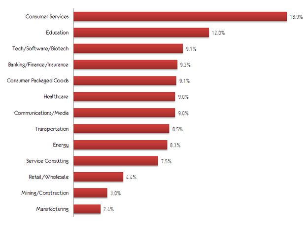
Luckily this is a quick fix in good old Excel. Two minutes later, you’ll have a little waterfall…
It is easy to see the outliers and the pack of eight that are close to each other (something you can’t even see in the original).
It will certainly take an extra couple of seconds to find your industry, but in service of the two bigger use cases, it is a small price to pay.
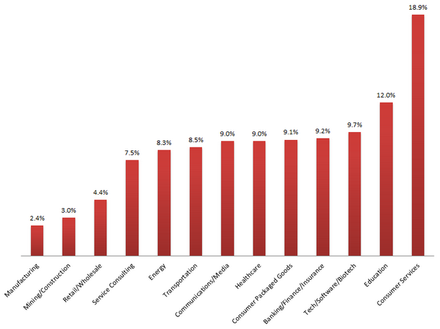
You can play with the layout to your heart’s content. If you dislike waterfalls for some reason and prefer towers…
I like the waterfall, but this is not bad. :)
Play with the colors, drop shadows, fonts, and more. Make the graph your own. Just don’t forget to look at it through the eyes of the end user and solve for their use cases.
(Speaking of colors… I’m partial to chart styles 17 through 24 in Excel. In my work you’ll see a particular affection for style 18.)
I hate pie charts. I really do.
You can read a 506 word love-letter to my profound dislike (including a lovely exercise you can do).
Here’s the scientific reason:
Comparison by angle is significantly more difficult than by length.
That is well on display below…
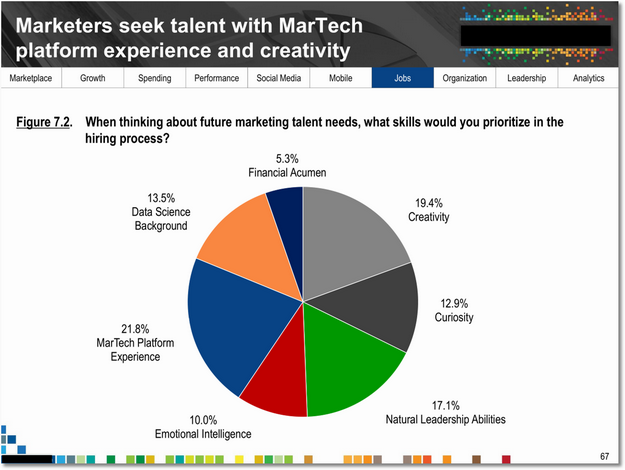
The colors in the pie will catch your eye. Yet, from the sizes of the slices it is difficult to internalizes the differences between each dimension.
8. Eat Pies, Don't Share Them!
Since humans find comparing lengths much easier, it should only take a few minutes to take the data and convert the slide above into something that closes the last-mile gap efficiently.
The above slide is a good example how to apply all the principles you’ve learned thus far. The question and the data are the hero, almost all by themselves. Allowing you to focus sharply on your story.
Scroll up and down and compare the two slides. You’ll see many more differences.
I’ve extoled the virtue of using a table, instead of trying to be extra sexy and throwing in a graphic.
The challenge with tables is that they can become overwhelming very quickly.
Here’s an example that illuminates that clearly.
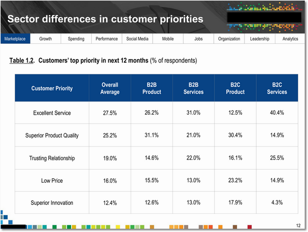
It feels like there is a lot. It also breaks principle #2, false precision, which makes things worse.
Considering the core message the analysis is trying to send, I believe that it is also breaking rule #4, extra perhaps unnecessary data.
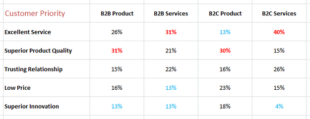
9. Make your tables pop, guide the reader’s eye.
There are numerous tools available to you inside Excel to make your tables pop. I usually start by playing with the options at my disposal under Conditional Formatting.
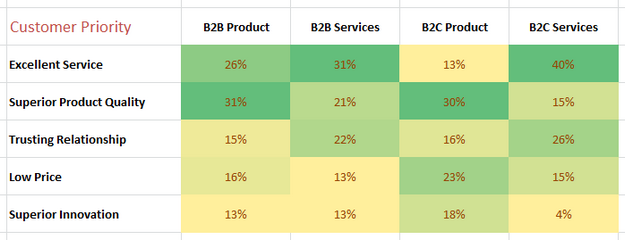
One straight-forward option is to use Color Scales, green to yellow, to produce a simpler table that pops…
The elimination of the overall average makes the table tighter.
It is easier to look at the trend in each column. What’s even more delightful is the second use case of comparing the highs and lows across the four dimensions. So much easier.
While all the data is still there, most senior leaders want to understand trends and the contrasts. They want relative positioning, the above table does not require expending too many brain cells to get that. And, if your boss does not trust you… She still has the numbers there.
Notice the combination of fonts, colors, style treatments, in the table above. Bunch of subtle points there.
If your personal tastes are different, no problem. There are other styles you can use.
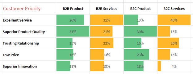
Here’s the data rendered using solid fill Data Bars…
In this case I feel data bars add clutter, but they make internalizing the trend across individual dimensions easier.
If, like me, you are biased towards radical simplicity via white space, you can keep the table. Consider applying some subtle font color treatment to create something that’s still a step change over the original…
I’ve shown the highs and lows in a way that you’ll see them quickly.
Red was chosen on purpose to emphasize that it was the most important thing from the customer’s perspective. Blue fades into the background a bit because it is the least important.
One final touch.
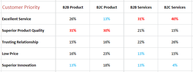
I felt it might be of value to see the product and services dimensions together, comparing them across B2B and B2C.
Here’s that version…
There’s a little air gap in the table to emphasize the two comparisons are different. You can usually use visual cues like these to help the consumers of your analysis.
We disagree on a whole lot of subjects in our country these days, but the one thing we can all agree on is that the human attention span is probably ten micro-seconds.
Add to that short attention span the fact that each executive has 18 other urgent things taking up their brain cells. As if all that was not hard enough, while you are presenting they are also likely on their phone or laptop.
Persuading anyone in these circumstances is a herculean task.
With that context in mind, how many leaders do you think will understand what’s going on here…
4 dimensions x 5 time periods x crazy swings = Ouch!
For bonus points, notice the randomness in the x-axis. It jumps from 2014 to 2017 without any visible explanation. To make things worse, look at the trend lines – they connect the two data points to imply a trend between 2015, 2016 that may or may not exist.
For even more bonus points, notice that there are four Februaries and as if it is no big deal an August is thrown in randomly.
Ouch. Ouch.
These might seem like small issues, but I assure you that you’ll instantly lose credibility with any intelligent leader in the room. They won’t raise their hand and start to berate you. They’ll quietly make a mental note about you, and then not pay any attention to anything you are saying.
There’s an even more important principle to learn from this visual…
10. Let the higher order bit be your north star.
It can be difficult to figure out how to go from the complex to the simple. My recommendation is to start with the most important thing you are trying to say.
In this instance the goal is to illuminate the percent change in marketing knowledge in the next 12 months. So, are the rest of the data points necessary and of value?
In service of the higher order bit, I would argue that we can also get rid of the two Februaries and the lonely August. (Though I sincerely respect the effort it took to get those data points.)
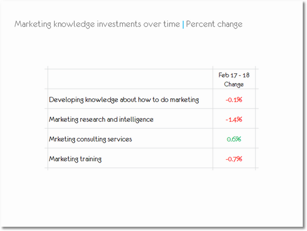
With those decisions we are left with just two data points. We can move to a simple table and close the last-mile gap by creating this slide…
Simpler, right?
We can do one better.
If the objective is to just show the change, we can just show the percentage change.
The colors help focus the attention even more.
To see the dramatic change, scroll back up and look at the original and then come back here. Incredible, right?
It might seem that this is hard work that takes time. It does take more time. But, it is not in the ink rather it is in the think. Discussing, debating, really thinking through what we are trying to communicate. The visualizing part takes a lot less time.
The biggest problem with this type of analysis, compiled into 95 slides, is that it never answers the question why?
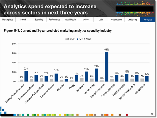
Take this slide as an example. It shares a very positive view of analytics…
The slide breaks all ten principles we’ve discussed in this post, but beyond that there is a bigger problem here.
11. Why. Your job is to answer why!
Your first instinct is the marvel at the shift (all blues are up!), and reflect on how this graph is long-term job security for everyone who reads this blog. But, you’re an Analyst and that good feeling won’t last.
Your mind quickly goes to… Why? What is causing this shift?
Look at Mining/Construction, 60 percent points of change. OMG! Why?
The entity creating this report sadly never answers any why question anywhere. Perhaps by design.
But, consider this: Data creates curiosity. If the Analyst does not satiate that curiosity via deeper analysis that explains why, the same data turns into a disappointment. It certainly drives no change.
I’ve written about this topic before, using an example from Econsultancy and Lynchpin: Smarter Survey Results and Impact: Abandon the Asker-Puker Model!
Without the why your last-mile gap is a million miles wide. If you are going to be in the data regurgitation business, please consider it your job to answer the why question. Without it all this is… fake news.
A challenge for you to tackle.
Now that you are aware of the 11 principles that aid in closing the last-mile gap, I want you to tackle something on my behalf.
I had not idea what to do with this slide… Can you create an after version?
Partly the issue is that I could not truly internalize what was being said. Partly it is that the numbers don’t really seem to change much. Partly it is because I was torn between the graphic and the table on the top right.
Regardless, I gave up. Perhaps you can teach me, and our readers, what a version with a reduced last-mile gap will look like.
Just email me your version (blog at kaushik dot net) or comment below.
Here’s a summary of the 11 principles you can use to close the last-mile gap:
02. False precision can cause clutter, and undercut the Analyst’s brilliance.
03. Remove the distractions, ruthlessly.
04. Show as much data as is required, and no more.
05. Experiment with visualization options, even in Excel!
06. Don’t send a graphic to do a table’s job.
07. Please, please, please keep the end-user in mind.
08. Eat Pies, Don't Share Them!
09. Make your tables pop, guide the reader’s eye.
10. Let the higher order bit be your north star.
11. Why. Your job is to answer why!
I wish you smaller gaps and more decisions that are data-influenced.
As always, it is your turn now.
In your practice, how wide is the last-mile gap? What do you think contributes to the gap the most? Which of the above principles have you used, to good effect? Do you have a favorite principle, or five, to close the gap? If you had to kill one practice when it comes to data presentation, who would be the chosen candidate?
Please share versions of the above examples that you’ve taken a crack at fixing. And, your lessons, best practices, and as always your critique via comments below.
Thank you.





 Via
Via 



There is one issue in closing the last mile that consistently arises that I would like your perspective on.
Convincing vs. Persuading.
With the right data, insights and visuals I have had 100% success in convincing people of my recommendations. However, my success rate in persuading them to act/decide is maybe 40%. I asked myself "Why is that when we all have the same insights, do some people not act?"
I have come to the conclusion that there is a huge EMOTIONAL component to persuasion. When people are attached to their idea or a course of action, rational arguments convince but not persuade. Showing them the "so what" or solving for the global maxima doesn't help.
Could you provide your perspective on how this can be done better?
Nikhil: The primary requirement is that we (Analysts) actually find insights that are material to the business, tied to the company's strategy. Then, we have to ensure there is no last-mile gap. :)
After that, we might still not convince some leaders for any number of reasons (including the ones you mentioned).
There are different ways to solve this problem. Two of my favorites are:
1. Framing the impact on them personally. Creating a tie between the action data is recommending and the direct benefit the personal bottomline of the person you want to make the decision.
2. Clearly framing the cost of inaction. Checkout the SEO Optimization Impact Analysis.
Avinash.
One of the big problems I have with radar charts is that people are drawn to the line or the area created by connecting the points, and they assume it means something, similar to how you say you're drawn to the dark blue bars in the other graphs. The five categories in this particular radar chart have nothing to do with one another except a common scale (order doesn't matter), and if you were to reorder them, you'd end up with a different shape, which may cause a different interpretation. The line indicates a connection where there is none.
For example, compare these two charts:
1. https://i2.wp.com/unfoldinsights.files.wordpress.com/2018/03/radarchart2.png?ssl=1&w=450
2. https://i0.wp.com/unfoldinsights.files.wordpress.com/2018/03/radarchart3.png?ssl=1&w=450
They both have the exact same data in them–a comparison between the turnover % of several departments–but the axes are in a different order. One accentuates the large differences, and one minimizes them. Now imagine we are comparing several companies on this same graph. We might be led to believe companies with the highly pronged shape by nature have wildly different turnover percentages among their departments, whereas the rounder-shaped ones have overall less variation, but it's simply not true! The shape is deceiving!
Secondly, if the axes are on a common scale, our linear-oriented minds have a difficult time translating which is farther from the axis. Radial distance is much more difficult to compare than linear aligned distances. Try comparing "Trusting Relationship" to "Superior Innovation"; it's harder than the first bar chart!
Overall, I believe radar charts should only be used to indicate cyclical data, such as monthly averages (e.g., https://i2.wp.com/unfoldinsights.files.wordpress.com/2018/03/radarchart4.png?ssl=1&w=450). For the particular data in the example, I'd much rather stick with a bar chart, or perhaps go one step further and use a table, following the 6th principle!
FYI, here is my go-to website for determining which graph type is most helpful for each visualization need: http://paldhous.github.io/ucb/2016/dataviz/week2.html.
Ryan: Really great points, both about how radar charts can be manipulated (your first two examples) and your advice for using them to indicate cyclical data.
In this instance, my goal was to quickly show two sets of data points to allow for a comparison. The area of the resulting radar was not under consideration. And, even if I monekyed with the location of the dimension, the comparison would still stand and communicate the delta.
But, there are multiple visuals we can create. If I had more time, I would have used the slope chart which would work beautifully here.
Many thanks as well for the pladhous link. It is a well curated advice on this delightful topic!
Avinash.
Ryan, I would say the example charts you have shown prove the exact opposite of your point.
Both radar charts comparing turnover rates clearly show the main point: IT, HR, and Sales have the highest turnover rates. This is made apparent very quickly in either version.
On the other hand, I find the cyclical radar chart almost impossible to read. SInce the month to month fluctuation in averages is relatively small, the resulting graph just looks like another tick on the scale, albeit superimposed and weirdly distorted. It's very time consuming to try and glean any trends or insights from this chart.
Depends on the audience (no.7).
By sending my eye to the sharp points (Sales and IT) this made me concentrate on the two big players as HR had a very shallow angle. Seeing the second chart was like a slap in the face; HR, 15%!
If the end user cannot see it, it has failed. (Maybe my career as an analyst is failing for not being able to see it!!)
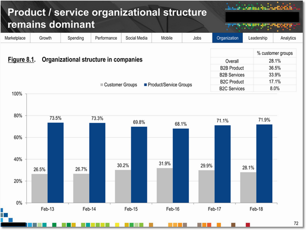
Sorry I tried, but I can't make a better version of the product/service organizational structure slide. The numbers indicate that you're either a "customer groups" company or a "product/service groups" company. The numbers therefore add to 100%, unless of course you use an error-prone process to create graphs that involves copy and pasting numbers from different Excel sheets, in which case you'd easily get 101% for Feb-17. Since I don't trust the process, I can only assume that there are basic errors in other parts too. Ideally, your process should be reproducible and automated through code.
Anyhow. I don't see how one or the other type of org is "better" so you can't make a recommendation or set a target. Since it's a mutually-exclusive choice I think the best use would be to segment other data/graphs by organizational structure. If I happen to know that my own company is a "customer groups" company it's perhaps more interesting to benchmark myself to other companies in that bucket.
BTW, from the respondents' perspective is it even easy to answer the question about organizational structure? If not, I wonder how many of them didn't answer, in which case you could have some self-selection bias there. Perhaps it's easy to answer if you are a B2B company, but not B2C. For this reason you'd want to see the actual number of responses, if only to work out how to get to 28.1% overall in the table.
Michael: Except at the very start where I made the point around fake precision, for this exercise I assumed that data collection and analysis was smart. As you clearly point out, there are many reasons to doubt that it might not have been. :)
The point you bring up about can the respondents even answer this question is an excellent one. We have to think that carefully before we decide to do something.
I love hearing your perspective, thank you for sharing it.
Avinash.
An amazing post Avinash. I don't know how many hours you spent on creating-writing, but know that I could not be more grateful.
I believe one important contributor to the last mile problem is that as we become more experienced we become more savvy and discover more. As a result we then want to impress our CXO with all the hard work we did. The story becomes long and confusing.
My key takeaway is ruthlessness. In this context it is much needed!
Thank you for this post. I made below version. It doesn't make use of the fact that figures don't change much but it takes advantage of the fact that the two bars add up to 100%.
I loved the part about pie charts. Thanks for that.
I also saw Ryan's comment regarding Radar charts. I am no statistician but it makes sense. I guess It follows similar logic to pie chart (not because both are circular but because of the relativity problem.)
HI! Thanks for the challenge with the last chart.I think the best I can do is to highlight the differences between B2B and B2C since the annual data doesn't really tell you anything, but I think my version still fails your “why” test.
I do understand why you were having a problem. It really begs the question about size and shape of the companies involved and that is what I would want to know. B2C is more likely to be focused by product line, but perhaps that has to do with the size of the organisations as well as the size of the target markets.
My hypothesis would be that it is easier to focus around a customer set as Boeing might (airlines) and then segment by size or by other characteristics. A 777 could be sold to point to point long haul as well as high volume short haul and could be configured in everything from all business to all economy seating.
If you are selling financial services to individuals, then it is probably easier to organise by product line because you want to sell the same target audience insurance, life, mortgages, etc but each of the products themselves have different regulatory issues.
Peter: I really love your metaphor of the Boeing 777 metaphor. I hope other Analysts find that to be pause worthy.
I appreciate you picking the table on the top right, atleast it is something. In this case there is no why anywhere, so you are doing just fine in that department.
Avinash.
Below is my response for the simplification of the challenge slide:
Notes:
1. I've chosen to color code the years instead of the Delta figures as the objective here is to show stability in organisational structure over five years.
2. I have completely ignored the table in the right hand corner of the actual slide as it is (a) incomplete (b) and thus adds no value to the reader.
Ateesh: Thank you for simplifying the story, we cannot go simpler than a two row table. :)
Very interesting choice to highlight the time elapsed!
Avinash.
Which tool you are using and why?
Aditya: To prove that we can create alternatives simply and with tools we all have, I've only used Excel in all my after versions. You don't need to go all crazy to get to simplicity.
For data visualizations that are worth it, one can use lots of different visualization tools. There are loads of them here http://dataviz.tools
Avinash.
This is a super valuable post.
Thanks for sharing Dataviz tools.
I am not an analyst, I am a marketer, so I would reduce that entire chart to a statement:
"In terms of organisational structures, over the past five years, the ratio of product/service groups to customers groups has remained roughly at 70:30".
The chart provided offers no clue as to why that is the case or why it matters, so why bother with the extraneous detail unless it helps people make a decision (one of your rules from elsewhere Avinash).
Paul: I agree with the benefit of simplifying this down to the essential. I'd used this in principle #6.
The lesson for Analysts here is that if you can get it down to that simple statement, you realize you have nothing. Then one of two decisions: 1. get rid of the data or 2. figure out something super-insightful from answering why. Either decision is a win. :)
Avinash.
Well, at least it shows I am paying attention to what I am learning here over time Avinash.
No amount of analytics or presentation skills can hide the fact that some data is largely meaningless because it tells us nothing of use.
Your principle of asking 'can I make a decision based on this data?' has been of huge value to me, simply because it stops many of my clients or students talking about largely meaningless metrics such as Facebook followers.
Great article, I agree with the value of simpler visualization.
What programs do you suggest to use say as a beginner and then advanced to help data visualization? There are so many out there and they keep growing so it makes it rather challenging.
Thank you.
Sanjit: There are lots of tools you can use. Here's one such list:
http://paldhous.github.io/ucb/2016/dataviz/software.html
Start with the ones you know, then move to the more advanced ones (each tool has a description on the page).
In this post, I've used Excel. More to prove that to express a true insight you've identified… You don't need anything super fancy to show that effectively. :)
Avinash.
Here’s my take on the last slide.
It's hard to completely understand the insight we’re supposed to take away! But I figure the important issue is the difference in B2B an B2C and thus we should ignore the trend — that’s a lot of ink to say that nothing is different.
Instead, a simple bar chart, sans axis of the 4% values for B2B Product/Service, and B2C Product/Service.
If I had the source data I may not even break out by Product/Service, because that doesn’t change the conclusion.
Without context I struggled to understand what the data was saying and why it's important. So I took some creative licence and assumed there would be extra data around that could tell a story.
Plenty of ways in and I've whipped up a few by hand that could be interesting to industry associations; marketing finance, HR and recruitment managers; vendors and category investors. Thanks everyone above for your comments, links and advice. Love it!
See attached PDF for my charts.
Great post as always, Avinash. There are two stories here: a significant gap between B2C and B2B and (possibly) a slight dip and then return for the % of product groups, depending on statistical significance.
I removed months and false precision, focused on the Product/service org types (the others are just 1-x anyway), and tried color coding to highlight the differences.
I must admit I just came here for the challenge once I read about it in the newsletter and still did not have time to read the post… ;-)
I have seen many great suggestions so far and here comes my proposal as well. It's a 1min sketch but I am sure you get the idea. At the end for me drawing charts is an art….no wrong or right, but sometimes some visualizations are more fit towards your audience and yes there are basic and advanced principles which have been proven themselves over time to be extremely powerful.
Hi Avinash,
Even though I don't know much about the data, just looking at it and going a bit "out of the box", I noticed that If you flip the "Customer Groups" data you can appreciate that in most of the years when there is a decrease in "Product/Service Groups" there is an increase in "Customer Groups".
Or at the following link: https://drive.google.com/file/d/1NI8yEywOlsCYbW7jYhbJ_akDm4TnjXOL/view
I think the blog and newsletters are great!
Congratulations! :)
Val.
Thank you for bringing attention to data visualization.
Perhaps data visualization should be considered central from the start, instead of being a “last mile” effort. From my experience, I have found that an analysis methodology centered around data visualization usually brings very good results.
As for pie charts, I do not particularly like them, but I enjoyed reading this blog precisely because it was against my own prejudice: https://eagereyes.org/blog/2016/an-illustrated-tour-of-the-pie-chart-study-results
In data visualization, sometimes we take for granted there are “rules”, but we have never really thought about where do these rules come from (at least it happened to me). In the case of pie charts and angles, the “rule” was formulated in a paper from 1926. The new study the blog talks about points out that probably angle is not what we use when reading pie charts. And even that donut charts and pie charts can be equivalent (for 2 partitions).
As for the redesign, I was not able to find a why, so I designed a chart to ask some questions and start a discussion. Here it is:
There's 2 things I took from the slide…
1. We don't know how the organizational structure is measured? It could be measured in total employees, group revenue, budget allocation? So I don't really know how to interpret the data.
2. The story seems to be that there hasn't been much change or fluctuation in the five years measured. Paul above makes the same conclusion and I like your cut-throat conclusion that if it doesn't really tell us anything useful then there's an argument for excluding it. If this is important for the business to know, then I wouldn't try to represent the data with a visualization of trend. It might be quicker to reflect the status in an easy to interpret way (See below):
My idea assumes that we're measuring organizational structure in employee size. I know it breaks rule 6 (don't use a visualization to do a table's job)! Depending on the audience, I might also include a table or a scorecard that shows a measure of fluctuation over the five years (variance, standard deviation, +/- margins to support the statement that the trend is consistent – if this data is important for the audience, a simple table with the 5 year average and the measure of variance could replace the visualization (and wouldn't be arule 6 violation).
I'd love to know what you and your fellow readers think.
Julian
Hi Avinash,
Thanks for another great post – This one now has a permanent place on my bookmarks bar, as a constant reminder of what not to do.
Growing up in an 'engineering heavy' org during most of my early career, I've personally struggled (and still do) to find the simplest and most effective ways to convey my message using visualization. As I was reading through the post, I could not help but smile in embarrassment thinking about the number of times I've been guilty of the 'mistakes' you pointed out.
However, I am also competitive by nature and was not going to let go of a chance to get some expert feedback (hopefully positive) on my current skills. So, here is my attempt at fixing the challenge slide. Please note that the messaging on the slide is based on my interpretation of what the original author was trying to convey, and would of course change based on the context.
Hi Avinash,
See the attached image for my take on the last slide of the blog post.
Really, we are just wanting to see which bucket organizations slot their people into. We have two simple buckets that fluctuate slightly over the 6 years, but mostly it just shows that the vast majority of organizations still focus more on Product / Service groups.
Let me know what you think!
Hi Avinash,
Yet again another great post! It's nice to know I'm not the only one who feels like that about data! I think one of the key points too when presenting it is thinking about what caveats to include too. So many data reports, because of the way they are presented, can be totally misleading.
Just think about government statistics and you'll know what I mean. Also I think one of the unfortunate things especially regarding marketing research and case studies is that you have represent the data right! Too many reports boldly state things like for example "the average … of …. is XXX" and the figures sound astounding – revolutionary almost. But when you take a closer look at the data sample, it's a really small sample, so in the big picture of things it's not really that accurate.
Another big problem is how the data is collected and/ or analysed – if any mistake is made with this when it is scaled up into percentages – a discussion for another day I think!
Alex: Very true!
I've complained that using Averages, Percentage, Ratios, Compound Metrics very often a sub-optimal way to communicate performance.
You might also like this post: A Great Analyst's Best Friends: Skepticism & Wisdom! 24 tips to comb through data with skepticism to ensure that what's left is believable and holy! :)
Avinash.
Thank you for this fresh perspective on how to solve the last-mile gap. Far too often, this is an overlooked part of our analytical investment.
A common thread through your 16 examples is the act of thinking hard about what the key point is. It is this investment that is missing from the effort of most analysts. I've noticed we are worried about the data and how we are going to cut it and send it out. There has to be a mandatory step of: Stop. Let's think about what we are really saying that's of value. Now proceed. :)
There is a lot of theory on data visualization on many sites and books, it is rare to have such a collection of examples from the real world. There are many author who share their work, it is rare to have an author bravely fix things and let us learn with them.
This is such a gift Avinash. Thanks.
Hi Avinash,
Would you have links to some other great real examples?
Mike: Here are some more of my posts:
~ It's Not The Ink, It's The Think: 6 Effective Data Visualization Strategies 01/17
~ Create High-Impact Data Visualizations: Nine Effective Strategies 07/17
~ Great Storytelling With Data: Visualize Simply And Focus Obsessively 09/15
~ Data Visualization Inspiration: Analysis To Insights To Action, Faster! 11/14
~ 7 Data Presentation Tips: Think, Focus, Simplify, Calibrate, Visualize++ 02/14
-Avinash.
Good insights here as usual. Thanks for putting this together
I wanted to comment on an issue I see in the second of your tables in section 10. I think it's misleading to look at the difference in values, in this case, because you're then studying the change in the change in marketing knowledge investments. Second derivatives are difficult to wrap your head around in any case, but you table is also not so clear that the data is being examined in that way.
A quick look indicates that total investment has dropped in three of four categories. In fact, the investment has grown in the past year, but at a slower rate. I also like to measure differences in rates as 'points' instead of '%', to clarify that an absolute difference in the rate is being displayed. As a counter example, the relative change from 6.6% growth to 6.5% growth is -1.5%.
I've also made an attempt at your challenge. I thought the original chart did a poor job of textually explaining what was being measured and failed to highlight that the two org-style options always add up to 100%. It also mostly ignored the notable differences between B2B & B2C in this metric. I cheated a little bit by looking up some additional data from the source reports. The time-scaled data shows a small change in B2B Product changes which is (as you noted) obscured in the average shown in the original chart.
Ryan: I appreciate the feedback. I agree that it can be confusing in some scenarios. Perhaps I could clarify that it is percentage points. Thank you for pointing this out.
I appreciate your simpler version of the challenge. I'm glad you cheated by digging a bit deeper in the original report (thus displaying true analysis ninja behavior!).
-Avinash.
Hello Avinash,
Thank you for the great content. I would like to ask 1 question about data visualization on analytics.
We've launched A/B tests without using any tools and i'm collecting its data from Tag manager by using 1st party cookie and it's defined in custom dimensions. And I created a custom report and collecting data successfully.
The problem is that when i add my goals, goal completion rate results are much more higher than the reality. In my goal flow report i can see the flow rate is as expected (i am checking it with some other tools like Omniture), but in the funnel report it's 20% higher than normal. And uplifted data is also shown in all my other reports when i check the goal conversion rate. So, I cannot check the real flow rate between desired pages in our A/B tests.
I tried to find a solution on web but i could not What could be the possible solution? If there is something unclear about my question, I would like to make detailed explanation.
Thank you so much!
Bilal: In these cases your best strategy is to consult with a GACP who can look at your data and help you with very specific guidance. Here's a list: http://www.bit.ly/gaac
On goal completions, it is important to know that you can have more than one goal completed in a session, and it will count. Sometimes this, in my case, yields a conversion rate higher than 100%. This rule does not apply to ecommerce conversion rate.
Avinash.