 During the delightful vendor panel at the Emetrics Summit in London a question was asked that I’ll paraphrase as: “What is unique about your tool’s UI for end users?”.
There were the usual set of answers: “We have great UI.”, “Would you rather have a good UI or accurate data?”, “We focus a lot on improving UI.”, “What?"… You get the idea.
Having spent a few years on the Practitioner side and having worked with tons of users of web analytics products I have to say that in the Web Analytics world there are few things more important than a good User Interface (UI).
Here is the main reason for that:
There are few decision making environments that are quite as data rich and information poor, containing complex definitions and metrics which are defined differently depending on which vendor you have! If things could have been made perfectly confusing then we have been there done that.
On the other hand we have Users of web analytics data and reports who are not sophisticated, they want simple easy to understand that they can translate into action. You can’t substitute the need to understand and do analysis to gain ground-breaking insights, but there is no reason for even the Newbie User to not understand what happened on the site last week at a high level.
Does UI matter? You bet you last dollar it does!
(And if you don't believe me just ask my friend John Marshall, CEO of Clicktracks!! :))
Leading a User Research team for the last few years gave me a great appreciation for how simple Design, Information Architecture, User Interface, enhancements can radically change the ability of a User to complete their task.
Specifically for web analytics good User Interfaces can help by:
- Instilling confidence in the User that they can trust the data they are looking at.
(by expert use of buttons and colors and layout and pretty exports of data etc). - Improving discoverability of data
(today most tools do their best to provide tons of data and then “hiding” it effectively so the User has to dig and dig and dig to find anything helpful, or worse they don’t know what to look for in which case the whole exercise is a missed opportunity). - Providing context
(why should we have “single metric” reports or individual isolated slices? why not surface contextual metrics automatically to help provide critical context to Users? example: here is the trend for visitors but look what happened to time on site and bounce rates and conversion rate and …. , and here is the key, why not everywhere?) - “Short-circuit thinking”
(new phrase I coined the other day, tools should be so do their best to not require Users to think up to a certain level, they should be so Customer Centric that they should “talk” and the Users can simply “listen” to the data without having to think, most tools force you to think even for primitive metrics / data – “filter this and apply that and then mix a whiskey and press this button to get your Visits by Search Keywords”, if you make people think for simple things they won’t use the tool / report / metric / data).
The reason most tools are where they are in terms of poor UI are there because we, Web Analytics, started in a world of rich data and then we had to figure out how to present it to the Users. Often we have not stopped to say, “let us think of what people actually want and see if we can present the data in a meaningful way”.
Let me illustrate some of the specific principles I had mentioned above with a tool I have come to love a lot, specifically isn terms of its UI. Measure Map is a alpha stage product that is now owned by Google (please see Diclaimers & Disclosures).
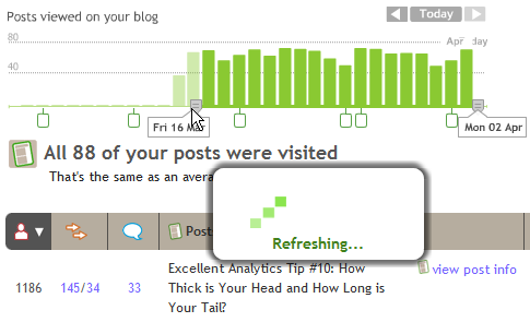
Go ahead and click on the image above. You have to admit it is damn pretty (ignore my ugly arrow marks). When was the last time you logged into a web analytics application and it looked so yummy?
Big bold use of text and colors. It clearly illustrates what time frame you are looking at (#1).
There is a easy to understand timeline that is “smart”: it helps you choose the time-frame for your report and at the same time shows you a trend of Visitors (#2).
Next up the principles of discoverability and providing context (#3). Your core KPI’s are listed clearly and provide the context you need about what is going on in the website. I discover that every single one of my posts in the last nine months has been read during the last two weeks (!).
Finally the principle of short-circuit thinking (#4). Rather than giving me a spam of numbers that I have to think through I get a quick summary that informs me of the performance and helps me understand what is going on.
Perhaps you’ll say that it does not give all the answers, it does not. But it does get me going on asking the right questions.
But it does not stop there, I am curious and dive deeper…..
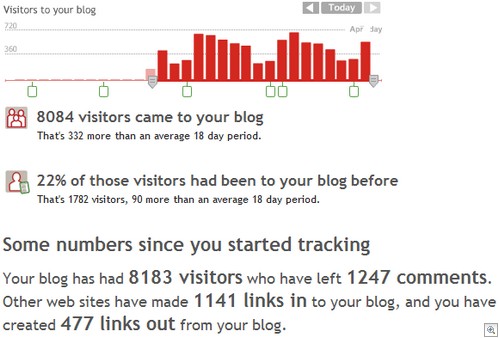
Notice there is no breakdown of “New” vs. “Returning” visitors that you might normally find. Rather a simple text: “22% of those visitors had been to your blog before”. Simple, anyone can understand. And as if it was not enough you get the raw numbers (1,782) and context (90 more than…). You’ll see the principle of providing context in action again at the bottom with other metrics to help you understand your visitor metric, by providing you a intelligent summary.
It is all in Ajax so even simple tasks are made intuitive. Want to change the time frame? Simply drag the slider on the timeline and let go…..

Your graph / report is automatically refreshed, you never leave the page and you never click ok. The principles of instilling confidence and short-circuit thinking.
We are all used to dashboards and graphs that have bunch of lines / tables, some of them are even pretty, but take a look at this one…..

Notice the application of principles 1, 2, 3, and 4. It shows you the trend and you can easily manipulate the timeline for summary stats. But it is also a “smart graph”, the little boxes you see at the bottom are days on which I write the posts. Suddenly the trend of comments is a lot more interesting as I can see the correlation.
There is one more powerful thing about this graph:

Not only can I hover the mouse to see the name of the post (nice) but it gives me a summary of how many comments I got on that post. Now here is the interesting part, the comments came over the next few days and the tool is smart enough to total them and show it to me.
Imagine a daily trend of Revenue on your website as the trend, the markers are each of your campaigns and if you hover your mouse it tells you aggregate of all revenue generated by each campaign (not just on that day). Would you agree that would kick butt?
Confidence. Discoverability. Context. Short-circuit Thinking.
There is no reason that every single web analytics tool out there does not ooze these principles and make life easier for every type of users. Get Newbies comfortable and understand data instantly with no training or empower the casual users to ask the right questions and do relevant deep dives or get the Numbers Gods the kinds of power they need to do what they want.
Having a great UI does not mean providing more, it means providing less and only what is relevant. Having a great UI means you no training for end users to get 100% of their initial answers from the tool. Having a great UI does not just mean sexy, it means useful. Vendors that figure this out will have unlimited number of profitable customers.
I disagree with the premise that Web Analytics is hard. It is not. We make it harder than it needs to be. It can be a positive experience and something that can be downright fun.
What do you all think? Care to share yummy features of the tool you use? Please share your feedback and critique via comments.
[Like this post? For more posts like this please click here.]


 Via
Via 


I liked John Marshall's comments on how the unofficial motto of ClickTracks is "web analytics that sucks less" and the vision of ClickTracks being the iPod of web analytics. Very colourful.
I'd like to see Ian Tickle from WebTrends elaborate on his thoughts in a comment. Vendor panels tend to become fragmented and rushed (you want to keep up a good pace and don't have all day) so it's good to get the full picture somewhere else.
I totally agree. On the 24th November, 2005, I called Measure Map a "work of art" (link above) not just for the visual interface but also for the complete "experience" of getting up and running with it.
What I really don't understand though, is why its been in hibernation since Google acquired the company. I also keep hoping that some of that visual "goodness" will filter through to Google Analytics.
I agree about Clicktracks. Most of the sites I work on choose Google Analytics because of the price. So then it costs money to have people like me stop doing actual analysis and spend time instead doing introductory sessions. I try to guide them through the maze of reports to the ones which are relevant to them, introduce the hidden delights of drill-downs and open the way to the paradise behind the cross-segment button.
But I always tell them two things first:
1) You would be better off paying a training and implementation specialist like GA-Experts to teach you properly, not a practitioner like me (but see 'price' above)!
2) Please take a serious look at Clicktracks instead. It does some very useful things easily which are hard with Google but, even more important: the interface and the way the tools are implemented hand-holds you and guides you in the direction of looking at 'interesting' stuff instead of a maze of menus. It encourages analysis and thought, not simple report viewing. And the freedom to segment on a whim, and apply the segment labels retrospectively, encourages that enquiring "I wonder what happened? I wonder who? I wonder if? I wonder…" mentality. Freedom to analyse, in fact.
From the look of this the Measure Map example takes things even further. I am fascinated!
Our company came to this same conclusion a while back about monthly reports that we send off to our clients. We weren't really getting any feedback from them, and our clients weren't really understanding what was being emailed to them.
So instead of adding more stats and more info, we totally revamped the look and feel, made it nice and pretty with vibrant colors, bigger and "bubblier" fonts, and everyone has loved it. It's almost as if people are more "into it" when something looks nice and easy on the eyes, and the information or statistics found within are really secondary, which sounds weird for me to say, but it's true to a degree.
Another good post Avinash!
Avinash!
Thanks! I thought I was crazy when I would tell friends that some of thetools available look like they are meant for accountants…lol At any rate, I'm a convert and believer of Confidence. Discoverability, Context, and Short-circuit Thinking. Many have echoed the difficult here on making reports relevant. In fact, our company had the same issues when selecting an Email provider. We went for ease-of-use rather than 4,000 widgets that do everything, if you had the time, energy and brain capacity to do it. I'm curious to see what will happen to Measure Map. Perhaps a GA version that would be so simple and beautiful.
Hi Avinash! Although I realize that you've used Measure Map to illustrate some non-product-specific report UI concepts, it's still a very compelling review of the tool.
I think that Measure Map works so well, in part, because it measures just blogs – and it bluntly asserts, "If you have a blog, here are precisely the numbers you care about."
Oh, if only all web content had such clear goals! On the whole I believe it's easier to define KPIs – and therefore easier to apply a nice, shiny UI – to sites with narrow scope and clear goals.
— June
June : Excellent thought, thanks for extending the conversation. Please allow me to offer two small thoughts.
#1) Except for the Comments reports there is nothing non-standard about MeasureMap. You are right it is a tool created to measure blogs, but the uniqueness is in how it captures data, not how it presents it. After that it simply presents standard web analytics data: Visitors, page view, exits, referrers, search key terms, browser versions, time of visits, countries etc. Yet even in presenting this data that is in every single web analytics tool it simply blows everything out of the water.
This at a time when a recent study indicated that the most confusing web analytics terms to Marketers are: Visits, Visitors, Unique Visitors (!!!). :) I doubt that would be the case if all tools took a similar approach to presenting Metrics (I'll exclude Mr. Marshall's ClickTracks from that, I think he and Dr. Turner are amazingly focussed in what they provide).
#2) Your comment brought another thought to mind. There are actually not that many businesses on the web. Ecommerce, Support, Lead Gen, Portals and maybe another couple.
Blogs have been seriously around for three years, Measure Map for around 18 months, if memory serves me right.
I wonder why we don't have hyper-focussed tools that are simply fantastic at measuring and then using a customer centric UI to present data/analysis? Should OmniTrends have a version that just does ecommerce? Should VisualTure have one just for support? Perhaps WebCoreStory Analytics can have one for Portals? I am sure there is plenty of money to me made by providing vertical solution?
Yet we have tools that try to be everything for everyone and are nothing for anyone. But surely that can't be a excuse to not invest in analysis friendly User Interfaces?
Now if other vendors do this, stop being YART (Yet Another Reports Tsunami) and do Verticals then they owe you lots of royalty for your suggestion! :)
Thanks again so much, it is great to have feedback from a industry legend.
-Avinash.
Hi Avinash,
I liked your answer to June; great YAARAWAV (Yet Another Avinash's Rant Against Web Analytics Vendors) ;-). You're right to challenge them, and I think it's about time we "de-focus" on behavioral analysis applications and really start thinking about how to articulate all the methods at hand. But since that market is invested with so much money and commercial interests, no wonder conversations so often turn around products.
Representing data, and better yet, information, is not an easy task, especially since the actual "look" will have a deep imapact on how it is understood. To that effect, I think it is healthy to revisit the data representation theories and discussions ("How To Lie With Charts", etc.). But your call for more clarity / ease of use is quite relevant.
Jacques: "Rant" is such a loaded word. :) How about gentel persuasion? I am just trying to make a small attempt at getting the customer voice to the table, and June's idea was a excellent one to build on.
Thanks for the comment.
Avinash.
The UI makes a HUGE difference, especially now that most analytics packages track the same data. I can't tell you how many times I've had to export data to excel or manually copy and paste data just to make the right graph to illustrate my analysis.
Most analytics packages do not give enough control and flexibility to the user when it comes to trending and graphing data.
The evolution of the UIs (and prices) of the various analytics providers has been excellent over the past 5 yrs that I've been in the space. (WT->HB->CM & GA). My yummy UI tool is LiveView and was wondering if there are any GA add-ons or mashups that will show graphically what is going on say a homepage?
ps: I'm looking forward to a new release of my favorite non-GA tool in another 10 days or so.
Great article, and to agree totally User Interface does matter! It makes the likes of Remember the Milk work so well – not only giving you quick and intuitive access to data but providing it with a user interface which clear, structured and enjoyable to interact with. I've emailed to sign-up to Measuremap so hopefully I can witness its UI soon for myself.
So when will MeasureMap go into public beta or some usable form? It's been owned by google with no follow up press or announcements for 14 months now! It seems silly to gush about a product nobody can get and is not apparently launching in the foreseeable future. Or are you gushing cause this will eventually fold into GA?
Great thought provoking post…. in my opinion user interfaces need to effectively communicate where you want people to click, to go, how to navigate, what to see, how to engage, and this is all done through good design…
It sets the whole tone for interaction with the website/app/product and definitely a key part of building a strong brand too (clunky UI = clunky brand!)