Like me, I'm sure you are working on complex challenges when it comes to data.
Multi-petabyte data warehouses. Multi-touch, cross-channel attribution analysis. Media mix modeling. Predictive analytics. Human-centric analysis. Oh, and let's not forget the application of machine learning to every facet of your work.
It is genuinely fun to work on these opportunities. They’re difficult, and every step forward offers a renewed sense of excitement and inspiration.
Despite the joy in these high-level, forward-thinking initiatives, I've disciplined myself not to let the unsexy fundamentals go overlooked. I’m particularly vigilant about avoiding friction in the core systems that facilitate the flow of money into the company and beloved products out of it.
So today, that valuable reminder for you kicked off via a case study inspired by Condé Nast. To inspire, and jump-start, a change in your focus, we’ll also look at Heal, Facebook and prAna.
Before we proceed with the stories… The unsexy fundamentals in this post focus on user experience. If you are a reader of my newsletter, The Marketing < > Analytics Intersect, you’ve seen me apply it to metrics (last TMAI was on Bounce Rate), reports, frameworks and more. The concept touches all facets of our professional universe.
Condé Nast | A Story of Unrequited Love.
Condé Nast is in a world of hurt, along with everyone else in the print business. In 2017, they've twice replaced the company's Chief Revenue Officer. They are pursuing a variety of digital experiments, and it remains unclear whether any of them will stick (unlike the New York Times, where new initiative such as "The Daily" podcast and T Brand Studio have proven overwhelmingly successful).
You might assume that Condé Nast, through these changes and new initiatives, would have solved the fundamental issue of subscriber retention.
Join me on that journey.
I love The New Yorker.
"Love" is an understatement. I ADORE The New Yorker magazine. I love David Remnick. And Amy Davidson and Sheelah Kolhatkar and John Cassidy and Jia Tolentino and… all of 'em. Hence, I'm proud to be a paying subscriber. The nourishment that your soul craves is in The New Yorker, and I encourage you to consider your own subscription.
As I almost exclusively read the articles online, I visited the website to switch to digital-only (from digital + print) when my subscription expired in October.
I recall this simple task posing a surprising challenge. I was busy, and ultimately, I gave up. Last week, in my guilt for reading articles online for free, I decided to try again.
The first step was to log into my New Yorker account.

I was already logged into the site and thus found this to be a bit of a nuisance. But, no biggie.
Post-login, I was taken to my profile page, where under the Edit button I received a lovely reminder of my tardiness.
[Full disclosure: The New Yorker, starting May 2017 had sent me at least 14 reminder letters via postal mail with a form to complete fill out and return with a check. I don't know who does this anymore, certainly not us. I want to add that I did not get a single reminder via email – with a direct link to renew. This despite the fact that The New Yorker has my email address, and it would be cheaper to send me 14 emails than printed letters. Clearly, the Department of Postal Mail is vigorous at Condé Nast.]

I clicked on Customer Care (but not before taking a tangent to explore what "Amazon Digital Subscriptions Manager" is, turns out to be the most expensive way to get a subscription to the magazine!).
Amazingly, I was asked to log in again, this time on a completely new domain.

It was a bit odd to see the captcha. I wonder just how many hackers are dying to access the Condé Nast subscription website to help process renewals!
Mildly irritated, I did as I was asked.
Once again, I was presented with a summary of my account, and I began scanning for my next action.
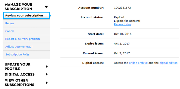
I simply wanted to change my subscription from digital + print to just digital, and to know what it will cost.
I scanned my options on the left navigation, with few promising options.
I give "Renew" a try.
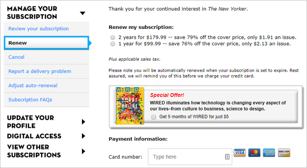
Wrong choice.
My only choice was to up the game to two years.
I wondered what the Wired cross-sell says about New Yorker subscribers. Had it been tested?
I re-focused.
Next, I tried "Digital Access." It seemed to smell right.

Wrong choice again.
This just told me how to access the magazine anytime, anywhere! :)
Back to exploration mode.
(At this point, I was not irritated. I realized there was a lesson to be learned. So I began taking screenshots of this unnecessarily painful journey, wondering if any Condé Nast employee had ever tried to change their personal subscription.)
I revisited "Manage Your Subscription," to make the next best choice: "Adjust auto-renewal."

Right choice? No. Wrong again.
I didn't want to update my credit card.
This, I was forced to resort to the last bastion of the frustrated: "Subscription FAQs."
I hate FAQs; they are almost always useless. Will Condé Nast prove to be the one exception to the rule?

"How can I renew my New Yorker subscription," seemed somewhat promising. I dutifully choose "clicking here."
Wrong choice.
I was right back to where I started, amazed that this company is in so much trouble financially but won't offer someone desperate to pay them a seamless way to do so.
Left to the footer, I clicked "Subscribe." At that point, what did I have to lose?

This took me to a third site, where, finally I was able to choose a digital-only subscription!
No. Not really.
This is a "12 Weeks for $12" offer that only applied to new subscribers. This offered no path for an existing subscribers.
What was even more frustrating — massively so — is that there was also no answer to my other question: How much would a digital-only subscription cost?

In fact, on this subscription page (the one I linked to when recommending The New Yorker above), there is no way to determine how much The New Yorker costs per year.
Let me say that again. If you are trying to subscribe — new or returning — Condé Nast does not tell you the annual subscription cost!
#OMG
What kind of con are these people running?
This put me at my wit's end. I'd failed to give them my money.
I revisited the second site to select "Chat Now."
Having logged in three times, as indicated in the top-right corner, I am asked once again to supply my credentials.

I waited an eternity for the chat session to start, completely absent of any status indication (x minutes remaining, or you are 10th in the queue).
Bored, I jumped back to the other window to tinker.
That's where I noticed the suddenly appealing "Cancel" link. Click!

I found the three choices intriguing.
How many of those who visit the page to cancel their subscription would like to improve the experience? (It was also not clear what "experience" meant.)
I opted to "Reconsider and save $10," simply because I love The New Yorker, and I wasn't going to give up on them. I am going to subscribe no matter how inept Condé Nast is.
A friendly message informed me that I was to wait for an email containing my $10 discount.

Why do I have to wait, I wondered.
Did Condé Nast have so many employees that someone was going to review my "case history" and validate my worthiness for the $10 discount, which, let me remind you, they offered proactively?
Ding!
My chat window came alive. Hurrah!
No. Not really.
"Leah" seemed unfamiliar with the Condé Nast platform. She directed me to pages I couldn't see, and asked me to go sign up for an intro offer which I knew I wasn't allowed to get (that was clear in the legal terms on the page).

After not helping at all, I admired her chutzpah in asking if she can help me with anything else.
Frustrated, I choose "End Chat."
I decided to wait for my $10. I felt I'd earned it by now.
Now, it has been a couple weeks. Crickets from Condé Nast.
Since I still love The New Yorker, I'm considering a digital subscription under my wife's name. She'll get 12 weeks for $12, which is sad as I want to pay full price.
12 weeks into that subscription, perhaps I'll finally come to find the full annual fee.
Ensuring loyal customers are able to renew and modify their subscription is the most fundamental of functions. It is not revolutionary to say that you really don’t want friction there.
Condé Nast has analysts upon analysts upon analysts. They have a world of user experience experts. I am genuinely and absolutely confident that these 400 people are executing large complex projects to save Condé Nast from financial trouble. None of them though thinks that that starts with something simple and fundamental: Fixing renewals. Or, telling people what a subscription actually costs.
To say that this breaks my heart is an understatement of galactic proportions.
Up next, you.
Condé Nast is hardly alone. I highly recommend a close self-evaluation to ensure that this isn't true for you as well.
To inspire prompt action by you, let me share a few more UX examples that are super-close to the company making money (the thing they/you should positively nail).
Heal | A Story Unfulfilled Forms.
Heal has an irresistible value proposition: They’ll send a doctor to your house!
I’m blessed to have health insurance. Still going to a doctor is such a pain, and even with an appointment the doctor makes me wait. Heal it is.
I install the mobile app, and proceed to making my first appointment.
The very first thing I have to enter is my date of birth. Seems reasonable.
Here’s the screen I get…

What!
What is the reasonable number of times the Heal UX team thinks a human should be expected to click the little < button to get to their date of birth?
I won’t tell you how old I am (very!), it is a lot of back clicks for me. A lot.
I just gave up.
For this article I opened the app again. There has to be a (hidden) better way.
I tried to click on “January 2018” hoping it pops up a calendar. No dice. I then clicked on “Sun, Jan 7.” Nope. Nothing else seems clickable. Looking… Scanning… Then, I clicked on the little “2018” on the top left. I get a list of years, score! I scroll, scroll, scroll, I’m old, scroll, and find my year of birth.
Consider this: You are a startup trying to upend the existing insane healthcare system. Should you have a simpler way to fill out the date of birth? Unsexy fundamental.
In the month of December, when I needed an annual exam, I could not get the address field in the Heal app to get my home address in there. (Unsexy fundamental.) I had to make an appointment and drive to the doctor. Oh, the humanity!
Facebook | A Story of Unsent $100s.
The only way now to get to your followers on Facebook is to buy ads.
[Bonus read: Stop All Social Media Activity (Organic) | Solve For A Profitable Reality]
No problem. After I would post something I want my Facebook followers to see, I would click the blue Boost button and pay Facebook $100. That seemed to solve the Reach problem.
Then one day a little while back I’m greeted with a new button: Boost Unavailable.

I have 45k followers on Facebook, without boost I get just 4k.
So I want this problem fixed. I want to give Facebook my $100. Except. Boost Unavailable.
When I click on that button, I get this, to me, confusing message.

A long time ago I had a personal page on Facebook. A couple years ago they informed me that I was not a person, I was a brand and forced me to change that page to “brand page.” I lost all my connections, and got followers instead.
Now, I don’t know what to do with this message. This account is all I have.
I click on Manage Page Roles, to see what my choices are…

I have to admit I am lost.
I am confident someone at Facebook understands what is going on, they even understand every option in the 19 choices in the left nav. Sadly, I don’t. The end result is that I can’t give Facebook my $100 and get my posts boosted.
As you might have heard, Facebook is just fine without my $100 every other week. They are clearing $10 bil a quarter. Still, an example of an unsexy fundamental that their user experience team could consider solving for.
prAna | A Story of Unfiltered Sadness.
I appreciate the opportunity to support businesses that solve for fair trade, green and sustainable business practices. If their products last forever, even better as I have to buy a lot less over time.
prAna is a good example of such a company. I also admire their brand building efforts – from the logo to the shipping envelopes.
I can’t afford their clothes at full price, but can’t resist looking at the men’s sale section when I need something.

Filters are your BFF when you are in environments with lots of choice. You can quickly go from being overwhelmed to narrow focus.
prAna’s site has loads of filtering choices: Gender, size, activity (yoga, hiking…), fit (slim, fitted), inseam, color, fabric (fair trade, HeiQ…), performance (PFC Free DWR, quick dry…), rating, silhouette (button down shirt, flannel, that’s it, really!), country of origin.
Guess what’s missing?
Imagine you have go trawl through hundreds of items on sale for clothing you need. What is the first thing you want to filter by?
Think.
Yes! Type of clothing.
Pants. T-Shirts. Jackets. Shorts.
That is the one filter prAna does not provide. Unsexy fundamental.
Even with the other 9 filters, it is hard to quickly find what I’m looking for.
#arrrhhh
I have received 7 emails in the last handful of weeks from them with this subject line: “40% Off: End of Season Sale – Your Favorite Looks are Going Fast – Don’t Miss Out.” I wonder how long it will take the User Experience experts at prAna to figure out why the conversion rate is zero percent.
If the UX experts shop on the site, they’ll find these unsexy fundamental issues everywhere.
The most common reason I return pants are that they are not long enough. Pants with 34” inseam fit me.
I was looking for new pair of travel pants. The Calculus Pants look like they could do the job.

Two weird things.
No waist size. I can take a gamble on M, but length is not a gamble I’m willing to take. I scroll around a bit. Nothing.
I click on “Size & Fit Guide,” in case it specifies something for these pants.

I get the generic guide. It is helpful in that it confirms that I need “Long Inseam.”
Except. That information is not on the Calculus pants page.
Scroll up. Scroll down. Scroll around. Switch to mobile site, because why not. Nope. Nothing.
Perhaps these pants don’t come in the three choices (Short, Regular and Long). But at least tell me what the inseam size the Calculus pants are! Unsexy fundamental.
prAna charges $8 for returns, for any reason. That is a lot. Hence… No pants for me.
[For prAna’s UX team, possible inspiration: Patagonia’s men’s sale page]
Bottom-line | Recommendations.
Unsexy fundamentals are very sexy. I recommend two actions on your part:
1. Create a dedicated (small) team to obsess continuously about the most fundamental functions. Ensure that you have a special rewards mechanism in place for them (like every other company out there you currently only reward people who work on shiny object projects).
The team’s work will start with the fundamentals closest to your core transactions. Cart and checkout for digital; cashier experience in your store. Build from there.
2. Create incentives for your employees to be secret shoppers. In fact, ask your CEO to try and do business with your company. The frustration she/he/they feel will drive amazing impact (on User happiness and company profit).
Sure, it will delay your multi-channel attribution predictive analytics powered single source of the truth initiative, but it'll be worth it.
2018: the year of doing the unsexy fundamentals well!
As always, it is your turn now.
Do you have a program/team in place to focus on unsexy fundamentals? What currently stands in the way of your company obsessing about ensuring all pathways to making money have been smoothed over? What is the primary mechanism in helping you figure out what unsexy fundamentals are broken? Do you have an example of a user experience, any mobile app or site, that is persistently frustrating?
Please add your insights, stories, frustrations, and wonderful accomplishments via comments below.
Thank you.
Bonus | Read: More examples and lessons in UX/Design, from HTC, United and Patagonia: Suck Less | A Plea For User-Centric Design: Powered By You
Bonus | Process to Implement: Heuristic Evaluations


 Via
Via 


Hi Avinash,
This is an article where I would press all the CxO people in a Company to read it and regularly test their own site – whatever conversions they might measure.
To help the executives: please find 5 regular people to test your site's UX using Nielsen's simple and very low-cost testing procedure: https://www.nngroup.com/articles/why-you-only-need-to-test-with-5-users/
Miroslav: It is incredible that these are from 2000, and still relevant!
Resources I go to for Mobile are: Principles of Mobile App Design and Principles of Mobile Site Design.
Avinash.
Although Nielsen's test is from 2000, the basics of machine learning / statistics / data mining algorithms are 100 – 200 years old, but still very useful :)
BTW: I really loved this post. I still remember very well your 90:10 rule and this is very close to it. A lot of company executives still focus on sexy stuff, completely underestimating the power of plain and simple logic and human-friendly approach. Whatever procedure / solution / product they introduce at the company, or for the consumer. Long-term-loosers!
Avinash,
Incredible article, the New Yorker is also my favorite magazine and it is beyond my comprehension why they make it so difficult to renew or make changes in the digital realm.
Thank you for all of your articles and again this was fantastic.
Hello Avinash:
There are many reasons to follow Occam's Razor religiously but one of the big ones is to constantly stay grounded in reality. This article is an excellent example of that.
I am frustrated that designers keep trying to reinvent the fundamentals or ignore them to solve niche issues. By now people don't need to be taught how to shop, the back button should trigger consistent actions, don't try to create five new ways to fill forms.
You've sparked a new idea at our agency. We are kicking off a project to make a list of unsexy fundamentals for apps and sites that we are going to deliver to our clients. The goal will be for the checklist to spark periodic investigation that none of them are being ignored or broken.
Thank you.
You are referring to art, not design.
Art is made by the artist to express themselves. Design is made by a designer for people. Some people mix this up in their job and see themselves as artists while they are actually designing.
Designers get often judged by the level of art, not design. One of the biggest challenges in the user experience community.
Trying out new things is good, but you need to evaluate if it works better and worth breaking a convention.
Could write a whole rant about this:-)
Bastiaan: I love, love, love your comment. Thank you for writing it!
This needs to be on posters: "Designers get often judged by the level of art, not design."
Avinash.
Good rant.
I'm sure you feel a bit better now.
Jeff: I wish I felt good.
I feel sad that a magazine I love is failing so badly at renewals. It is in my interest for them to make lots of money.
Avinash.
I am grateful to you for sharing your reflection on our user experience. We are pushing one fix out pretty quickly later today. Another important one next week. Hopefully you'll like the new updates.
As you suggest we don't have a dedicated focus on the basic experiences. Something the team is going to think through seriously.
Thanks Avinash!
I had a very similar experience as a renewing New Yorker digital subscriber.
After multiple attempts, I finally decided to subscribe via Texture which was comparatively simple. The New Yorker missed out on my sustained membership.
Why don't they want us to cram $$ in their wallet?
I would say that the unsexy fundamentals are sexy simply because they are directly connected to the thing I adore the most: revenue!
At my company we work very hard to remove every click, every field, every page from paths that lead to conversions. We have a quarterly program in place that rewards increase in conversion rates that this process delivers. In the last year being able to use Google Optimize to test "crazy ideas" has been a huge boon in dealing with Hippo driven ideas.
Great job in helping shine the light on sexy fundamentals. :-)
How can it be ten times easier to cancel your subscription than to change it?
The print business seems to be hanging on to their past in more ways than still executing their business model as if it were 1970. Your experience shows that they truly don't get digital. Another manifestation of this is their overall tiny share of the digital advertising market. They are still chasing purchasers of the back cover.
I find this whole thing heartbreaking as great journalism is need more than ever before.
Wonderful post avinash, bravo!
We end up in these situations because our bosses want us to drive airplanes before we, our company, learns to ride a bike. It is very difficult to push back against this. If you have tips, I would love to have them.
My favourite doh example in this post is prAna. Such a fundamental thing overlooked, and yet it is so immensely critical.
I loved your examples.
I have faced this situation myself while working with a popular hospitality brand. I don't understand why big brands fail to work on fundamentals when it comes to digital.
Aditya: There are many reasons, but two primary ones stand out.
1. The leadership at the very top is not natively digital. They are paper people, they love the texture, they grew up with the 100% perfect placement of every font, words and images on page 87. Digital does not interest them in a way that it should.
2. The money flow is not there. You look at the NY Times and 2.5 million or so digital only subscribers. They got there by executing a very clear and focused strategy, and in everything they do digital is front and center (making money, innovation, strategic discussions). For almost all Conde Nast publications there has never been that sharp focus on digital, hence most money still comes from non-digital sources, which in turn means there is more obsessions with non-digital, and digital languishes.
Mind-share. Money. :)
Avinash.
Great point Avinash.Totally agree with you. If Conde Nast wants to make more money and grow their digital business, they definitely need to separate their Digital unit from the non-digital. As long as both the unit is operated under the same roof, non-digital will always get the most of the resources and digital will be treated like an extra player in the team, though they don't admit it that they are doing it.
I'm impressed with your attention to detail and for staying objective while going through this obviously frustrating experience. The resulting lesson as a result is priceless.
The learnings in this post are simple, but in today's times simple seems extraordinary.
Thanks Avinash.
God I love this post Avinash. We do talk a lot about sexy concepts like the ones you've mentioned, but we never talk about the simple stuff (unsexy fundamentals). Whenever I hear people talk about "Big Data" I always reply "Big Data??? We still suck a little data"
And if I may be so bold to add another example. I recently purchased some cologne from http://FragranceNet.com . I didn't know it entitled me to immediately receive emails per day from them. 3 effing emails per day.
Dean: My two "favorites" to add to your list of terrible email behaviour are Hotels.com and Shutterfly.com. Never ever sign up for their emails. It surprises me that no one there is thinking we don't stay in hotels or print photos twice a day!
#dontsuckatlittledata :)
Avinash.
I work as a UX Analyst for a Scottish bank. I'm using analytics to feed insights to the UX team so that we can continually identify and fix these 'unsexy' problems.
In your experience, are companies starting to combine these two disciplines – design and data?
Cheers, Bobby
Bobby: Your path is the one that everyone should take!
The very first Analytics team I had the privilege of leading very quickly had both Research and Analytics pieces. Research in those days were usability labs, field research and we added surveys to that. Analytics started with site analytics (using log files) and then expanded to an environment where we could bring different business data together.
Both sides of the house benefited from the other. Analytics got a lot more why, UX/Design got a lot more what
The way to truly win: Analytics + Research. Quant + Qual.
Avinash.
Great article. These sites are right up there with those who require your personal info before they even tell you what they do.
Or those sites that offer you a freebie, ask you for your email, tell you that you are already on their email list, and then automatically send you an email to reset your password. They never send the freebie.
Mike: I have something just for you: https://temp-mail.org/en/
It is a disposable email address. It only lasts a little bit and poof it is gone. I go to the page, use the email on the top to sign up for the freebie/whatever site, read the email on temp-mail, and then decide if I really want to sign up or I'm done. :)
Avinash.
You have a knack for naming things, love unsexy fundamentals.
I was looking over the magazine that I love, The Economist, they are sadly not much better than your experience with the New Yorker. Perhaps there are common threads across print entities. Hopefully they are reading Occam's Razor.
This blog post also brought a smile as I'm working with a client who wants AI, Big Data and Programmatic. A quick glance at their website showed me that they don't get the basics right. I'm wondering if I should run into their arms or run away. :)
Mark: Sad to hear about the Economist, another great publication.
Re your new client, if you feel you can have a material impact run to them. If not, run away to a different client that will listen. Every company has to balance for things that will make them money right now (examples in this post) and things that make money in the long-run (the ones you list). If one does not have that balance in their work, it is better to find new pastures.
Avinash.
Thank you for validating my "crazy" obsession with carts, checkouts, new buyers, renewals, and other such pages/people/segments. I've always believed that if you can't do the basics well, why would you believe that you could be good at the complicated?
Great post!
Avinash – As the world of data becomes more available and easier to understand (with the right context and people), I am amazed that UX/Design never seems to ask the analytics team for data or insights.
When we have shared insights with UX/Design before, they are always grateful and excited. Then after the meeting, they will go right back to solving problems without ever involving analytics.
How have you helped UX and Design realize how beneficial analytics can be to inform decisions, rather than just measure outcomes?
Scott: It is simple, as in most cases of this type: Figure out how to deliver a promotion or deliver the painful reality.
In most companies designers are less appreciated than they should be, which is a bummer. We Analysts can help fix that by using an A/B testing process to showcase directly how much the new designs are delivering in terms of value. We can also help focus the work of designers by bringing them problems we are finding (bad landing pages, nav structures that are not working, high abandonment of carts and more). As they work on these, their value will be highlighted in the fixes, and they'll get promoted. Thus becoming your BFFs.
If this does not work, frame the value of design solving problems that data deems important. Take bounce rate, multiply it by the cost per click, there you have a simple computation of money wasted. One big contributing factor is ux/design. Take other pieces where ux is delivering bad results (lower customer satisfaction, nps), quantify business impact. More pain. That should cause the management, and ux/design team/s, to bite.
Try the let's get them promoted route first. :)
Avinash.
Hi Avinash, Great post as always. Few Things that I find frustrating –
1. Another problem with the Size is not the availability of the right size that I was looking for and no way to communicate it to the business. Recently, I tried to buy an amazing red sneaker from an e-commerce store in India. I loved the product too much and decided to buy it, then realize that the size I was looking was not in stock and there isn't any way to communicate this to the business. I loved the product so much that I decided to buy it from outside my country but can't able to find that shoe elsewhere. Now after every few days, I have to go back to their website to see if it is now available or not. Not availability of right size product is a big problem for online retailers, still, they don't try to fix it. Zappos has done it right. if I can't find the right size, they give me an option to notify me when it will be available. – https://m.zappos.com/productNotifyMe.do?productId=7166039
2. The big problem with the Reviews. As long as the average reviews are 1,2 or 4,5, it's not difficult to decide whether I should buy it or not. The things get messy when it's 3.5 :) Can't able to understand clearly what should I do? Love the Patagonia's review system. Do I recommend this product – Yes or No. Simple but effective rather than trying to understand from reading lots of customers review. I think Patagonia can make it more better by letting me filter the results with raw numbers of Yes or No recommend system. Easier to make the decision to hire or fire the product.
BTW, love one unsexy fundamental on your blog that has been done so right. Not having me to write my name, email and website name, every time I try to comment on any posts. The blog takes good care of it :)
Thank you.
This is a fantastic article.
Great article.
There is a third solution to help solve the problem….. invite your customers to provide feedback and then act on that feedback. You'll be amazed at how many customers will actually take the time to give feedback when given the opportunity to do so. Some of the best performing websites make it easy to provide feedback by have a persistent feedback button throughout the site.
By adding qualitative feedback to quantitative analytics data, companies can start to understand not just what is happening but why.
Try subscribing or changing addresses for New Yorker from outside the US & Canada – it is actually worse.
It requires both ninja like digital skills and persistence.
But you're right when I needed to cancel it was easy.
Hi Avinash,
Great article as always.
This comment is off-topic though: I'm a TMAI Subscriber but get regularly asked by your delightful popup if want to subscribe. In your analytics, wouldn't you identify me as someone "disinterested in your newsletter" because I closed your popup?
Why don't you add an option like "I've already subscribed" to get a more accurate conversion rate.
Florian: I appreciate your very appropriate feedback, thank you.
I use the excellent HelloBar for the popup. It is currently set up so that you would only see it once every 60 days, and once every year if you'd signed up at any time. If one of those is not working, I'm to understand that the browser might not be accepting third party cookies.
I have tried to use the UTM parameter to ensure the pop-up does not show up for people who click-through on links in TMAI. I think it is not working, I'll try it again.
Avinash.
It is amazing to see some of these mistakes in the real world. They seem simple. Yet are so prevalent as validated during our daily digital adventures.
Thank you for ringing alarm bells.
Thank you, Avinash.
This is an extraordinary article.
Regards
MJ
While it's true that many in the print sector are struggling, it's also bringing new opportunities for the smaller, niche players.
It will be great to see who comes out on top in the coming years.
Amazing and useful advice.
I agree totally with everything Avinash says.
Thanks for the lighthearted banter, had a few good laughs too!
-Roger
I signed up for the Economist today and immediately thought about your article :)
After providing all my personal details when purchasing the subscription, I had to confirm my email address and then create a new account with the same information AGAIN, although I just provided all the information. After that, I still had to link my subscription to this new account.
I (still) like the Economist but that's too many steps!