 We have already beaten this horse dead, several times over: Web analysis is hard, there is too much data, don’t know how much of it to trust.
Also yes your job as a web analyst is a very hard one, even if you overcome the data hurdles there is still the challenge of convincing people to listen to you and take action based on your analysis / insights.
Perhaps it is because we swim in “session_id’s” and “shopper_id’s” and “evar’s” and “parameters” and “strings” that often the analysis that comes out of all that excellent work is very "dry". One of the reasons our decision makers don’t jump up and take action is they have a hard time relating to our analysis due to its “dryness”.
Hence Tip #4: Make data “connectable”. Quite simply this means that we should take as much of the “technical” / “dry” stuff out of our analysis, or should I say recommendations, and try to make it easy to understand from the perspective of non-analysts / business users.
This could mean using “pretty pictures” (slides or graphs or colorful tables or click density report screen shots), it could also mean using language and terms that “hide” some of the dryness and make our data easy to understand and to relate to.
There are tons of pretty picture examples (see my post on data visualization for one such example of "connecting" via pretty pictures). Hence I’ll illustrate this analytics tip with a language example.
I am sure you have done reports on “site engagement”. There are many ways to define site engagement but a definition frequently used is “number of pages viewed” on the website.
Perhaps a normal report for you is Site Engagement and Purchasers.
So you crank up your favorite analytics tool and produce this report (after applying the rules that: 1. usually absolute numbers are sub optimal 2. trends are magnificent and 3. segmentation is God’s gift to analysis):
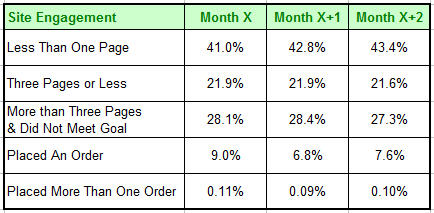
This is a very insightful report and it is extremely easy to read and understand for most of us. As we look at it potential actions jump out at us right away.
But to a business, non-analytical, user perhaps they can pick up a clue or two from this but I would hypothesize that they might not get as much out of this as you might want them to.
Now let us try to make this “connectable”:

Ahhhh simple sprinkling of the english language and the table, with exact same data, “speaks” a lot more to any kinds of data consumer.
Now when our business decision makers see this data they are able to internalize it much more. They can relate to the english terms we have used much more then they could understand segments as defined by page views. The numbers are the same but this table will suggest action to our decision makers.
In real life when this was done here is what happened :
- The users wanted to know the definitions, this meant they actually bothered to learn what each segment was in a way that did not happen before.
- They looked beyond the site conversion rate (represented by the one-off-wonders, loyalists) and from the numbers truly understood the opportunity landscape that the first three sets of numbers represent.
- Since the terms used are very reflective of the persona way of thinking the terms became ingrained in the company culture (especially marketing). People started talking about Flirters and how to convert them into Browsers and meetings where held to specifically target Browsers and get them to become buyers and special programs were created for Loyalists (because they were so rare).
You can’t underestimate the power of your customer segments becoming a part of decision making culture.
- Additional monthly analysis were created for each segment with someone assigned to “take care of the browsers and give them some love”, (translation: what action can we take?).
This is an extremely simple example of making data and analysis more “connectable” but hopefully it illustrates the power of stepping beyond our level of thinking and into the world of our decision makers and as a result doing something simple to have a big impact.
Choice of words and careful thinking can enliven the simplest or the most complex report helping us communicate our message more effectively, as well as in some cases atleast bring about some fundamental change in our organizations.
Agree? Does this make sense? Not buying this at all? Do you have examples where you did something different to make data more “connectable”? Please share your feedback and critique via comments.
Props : The original creative spark for this specific approach came from listening to a presentation by Tim Boughton of Holiday-Rentals.com & WVR Group at the eMetrics summit in London. I have evolved Tim’s suggestion a bit above. Suffice it to say the data and profiles above don’t remotely reflect that of Tim’s employer or mine, though if you find it useful please book a vacation at his employer’s website or buy some financial software from mine. : )
[Like this post? For more posts like this please click here.]


 Via
Via 


Hmm so that's how segment naming works in this industry : Avinash names them ;)
I got 1 euro right here that says we'll see 'flirters' as a visitor segment in WA reports in the days to come! Who's with me? ;)
Hi Avinash, Hi Julien,
I hope you are both well.
My first reaction was that I agree with you: make the data digestable but I'd also go a bit further to indeed make pretty pictures out of it ;-)
It, of course, depends heavily on who you're presenting the data to, but most marketing managers will prefer – I'm almost afraid to say – histogramms with pretty colors.
So my suggestion would be to use those BI tools to make your data sexy. I love for example Xcelsius for that. You generate your reports in Excel (if we're talking about this kind of extract) and then plug this to your BO tool, which will export in nice little Flash files ;-) Success garanteed!
It's also very soothing to do this, after you've scratched your brains over so many other issues ;-)
The other thing is that ok, once you've set the benchmarks for the representativity of your different personas, it's not like it's going to jump up and down like crazy. So next step would be to calculate increase rates for the different segments.
As an example, I'm interested in the fact that the Abandonners have jumped over 2.4 points over the last 2 months and would surely like to know why.
That's usually when management starts to say "Nice but… why X, Y or Z?" and then you have to dig into the data again.
That's a bit the issue I'm facing today: distributing the reports and making people responsible for it. I'll grant you that it's got nothing to do with technology or analysis and everything with organisational changes.
Anyhow, getting back to the example, it's the difference in representativity of these segments you'll be looking for next time around and over time, mostly if, as you said, people start taking action on the basis of this data in order to make Browsers out of Flirters.
Just a rapid thought from Brussels, keep up the good job, both of you!
Cheers,
Aurélie
For web-based information – that is, stats that can be retrieved from an online database or online log file, I'm flirting with generating pretty pictures using a mashup of the Sparklines plugin, http://sparkline.org/
I don't have anything yet, but when I do, I'll let Avinash know.
Hi Avinash,
It's late and I need to read your post more closely but did want to comment that I agree with you in making web analytic presentations that someone wants to look at – and it's not easy, like you said.
I did a post the other day titled "Emotion and Logic both needed in Web Analytics" or http://www.webmetricsguru.com/2006/07/emotion_and_enthusism_needed_i.html
What I liked about Bill Tancer's post (of Hitwise fame) is it was not only crystal clear – it was also interesting to read and he made an emotional connection with the material – in this case Cycling sales going up because of the Tour De France.
Bill had injured both hands in a Cycling accident recently, and is a Cycling enthusist (my spelling is off….it's late) – and when his friends asked him to see if there was a connection between the sales of bycycles that are featured in the Tour De France and the contest – he did it with passion, feeling and precision.
Every manager wants this – even if they don't say it – that want not only to know what they should do – but they want to look at something that evokes interest and connection. I think I'll sign off for the night with a suggestion to leave room for passion and emotional connection (Art, in short) in Metrics and Web Analytic work.
Hi Avinash,
I don't know you but I subscribe to your blog and learn much from it.
I'm wondering if you can elaborate on parts of your tip#4 entry about making reports visual and using plain english to make the data connect with readers.
I monitor something similar to your above engagement report. I basically segment along the number of page views per visit. But since we don't use a cookied solution (we sessionize with IP and browser agent… for now) I can't get reliable data on returning visitors (therefore no "loyalists"). If I look simply at visits and segment according to pages viewed, can I count this data as useful? It seems to me that it tells a lot about my user mix (% browsers vs. % abandoners vs. % deep explorers) but I can't segment from these user categories those who converted on a given action, for instance.
So, (like your table above) at the bottom of my table that includes my abandoners and deep explorerers, can I just add the overall site conversion rate for a given action (i.e., converters or downloaders)? The problem if I do that is that my categories are no longer mutually exclusive (a browser can be a downloader) but in your table above, the categories seem to be. I don't see how I could separate the two right now with our logfile/cookie-less solution. Am I correct in this assumption?
If my questions do not make sense, it's probably because I'm not sure how one would go about creating a segment of "visitors who saw 3+ pages but did not meet goal" as you have in your sample table. So if my above question is too convoluted, could you please just elaborate on this last point?
Thanks for any insight you can offer.
Eric
Great post Avinash,
We have found with our clients that layer the behavioural data on top of our attitudinal metrics, that voice of the customer decision support gives this 'dry' data real upward mobility, and of course 'connectability'.
Eric Piché: Let me try carefully to reply, hopefully without causing confusion.
1) Loyalists are not returning visitors, but rather multiple purchasors. So during the month how many people purchased multiple times, rather than your logs you could get this from your orders database if that is possible.
2) Yes absolutely you can look at this by visits and segment and it will be very useful, as a matter of fact the data above is counting visitors based on "cookied" data but it will be just fine with log file based data.
3) I should have been more explicit. In my table "one off wonders", second row for the bottom, is conversion rate really. You are on the money. Just use that. Yes that is "double counting" but not by that much (unless your conversion rate is 45% then double counting is not good : ). Please do use conversion rate.
In your case, if you don't have access to orders placed on the site (or whatever your conversion point is) outside of logs I think you will have a harder time doing the very last one, multiple purchasors.
4)
This one is tricky and it very much depends on the web analytics application you are using. But if you have a way of creating "sessions" in your logfile solution, and there are many ways to do that, then your query is simple "sessions with more than three pages but no page_name equal to goal.html or thankyou.jsp or confirmation.jhtml as the case may be for you". Does this help?
Thanks for taking the time to comment.
Aurélie: Your suggestions are all very excellent, and I recommend we should all follow them. The post does not recommend replacing "pretty pictures" with "connectable" tables. But rather how even tables and dry data can be presented in a way that it will have outsized impact (even with limited data). Thanks for taking the time to comment.
Hi Avinash,
Thank you for the interesting and helpful post! When I first looked at the second table I was thinking: "what's the big deal – so now there are names for each segment." Then I read on and learned how much simply having *names* affected the corporate culture. Amazing! What a great idea, and such a simple way to help the team internalize your concepts.
It's also interesting to think about different ways of segmenting (ie, not by depth of the visit, but some other sort of segmentation), and see what kinds of personas you come up with for those. For example, what if you segmented by people who exited the site on the home page vs. a product subpage vs. inside a shopping cart. It's subtly different than the flirter/browser/abandoner/etc. but I am curious if it shows you something different.
I will have to look into some ways to integrate names into my work. Thank you so much,
Gradiva Couzin
http://www.yourseoplan.com/
I work on web search analytics and I love your blog. This post, especially, was very insightful.
Things I would love to hear you write about (maybe you have already, and I just havent spotted them yet) :-
1) What are your thoughts and ideas on analytics metrics that will give an insight into what customers will do in the future?
Examples: What changes will provide the most impact on customer satisfaction? What is the impact/severity of say, an abandoned search? – some numbers that tell the reports users how much of an alarm causing issue this should be.
2) Metrics and reports that spell out customer satisfaction rather than requiring the report users to infer this from various other metrics (such as clickthrough for top queries etc.)
Avinash,
You mentioned site engagement and I just thought i'd let you know that I've just finished writing a new white paper on the topic of engagement scoring using Unica Affinium NetInsight at Web Analytics Engagement
I really believe this is the way analytics is going more and more in terms of measuring not only what people viewed but how and what that means to the business.
Thanks
Matt Hopkins
I know this is an old post, but I thought it reminded me of how reporting metrics data to clients are very important part of the web analytics process.
A lot is mentioned about what and how to measure the site traffic, but it becomes very challenging when you start reporting it to the client. Even more challenging to report when your client is new to web analytics. Also too much data is not good as well. There are so many angles and data points that we need to think about prior to catering the data to the client.
I have my blog site addressing some of the reporting aspect of analytics.
Thanks,
Kris
Hey, I would just like to say THANK YOU VERY MUCH!!!! It's really usefull. I am now implementing this into my website holidayhouses4u.com
=]